Notes are a great way to provide annotations and references. There are different kinds, but all are pretty self-explanatory in their names: sidenotes live on the margin of a page, footnotes live at the bottom of a page, and endnotes live at the end of all pages.
But this only applies so far to print. In print, footnotes are in close proximity to the annotated text, staying in the context that they extend from. On the web where the scroll is vertically infinite, however, footnotes essentially become endnotes and quickly lose their relevance when articles lengthen (Note: For example, this is a longer essay I wrote with footnotes.).
Reaching to sidenotes is the logical next step. They not only amend the pitfall of footnotes, but also give more life and variety to the page (Note: Bringhurst, Robert. The Elements of Typographic Style, p.68.). Implementations of sidenotes abound, and Gwern has written a round-up for us (mesmerizing website, by the way). I decided to adopt Tufte CSS as I normally don’t have heavy sidenotes that will cause overlap.
Here’s the bare bone markup of my sidenote:
<input type='checkbox' id='toggle'></input><label for='toggle'>::before <!-- Number after the annotated text -->::after <!-- Underline, indicate interactivity on mobile --></label><small class='layout-wrapper'><span class='side-note'>::before <!-- Number before the sidenote --><span class='no-css'> (Side note: </span> <!-- Not visible -->Side note content<span class='no-css'>)</span> <!-- Not visible --></span>::after <!-- Line --></small>
The core idea of Tufte CSS’s sidenote is a <label> for number, a checkbox <input> for showing and hiding notes on mobile, and a <span> for note content. I built upon this structure and tweaked a few things for my layout and design.
First, the not-so-clean thing I did was adding another wrapper around note content for positioning and layout. Not so much to talk about as it’s specific to my case. I used <small> so that sidenotes will still be in smaller text size even when there’s no CSS applied—which brings us to the second point. Inspired by Koos’ implementation (Note: Shoutout to Asmilex on Posts for sharing!), I included two visually hidden spans to wrap “(Sidenote:” and “)” around the note. Again, this results in a better experience for places without CSS, such as RSS reader and screen reader. Finally, I added an underline for the label to provide better affordance of interactivity on mobile.
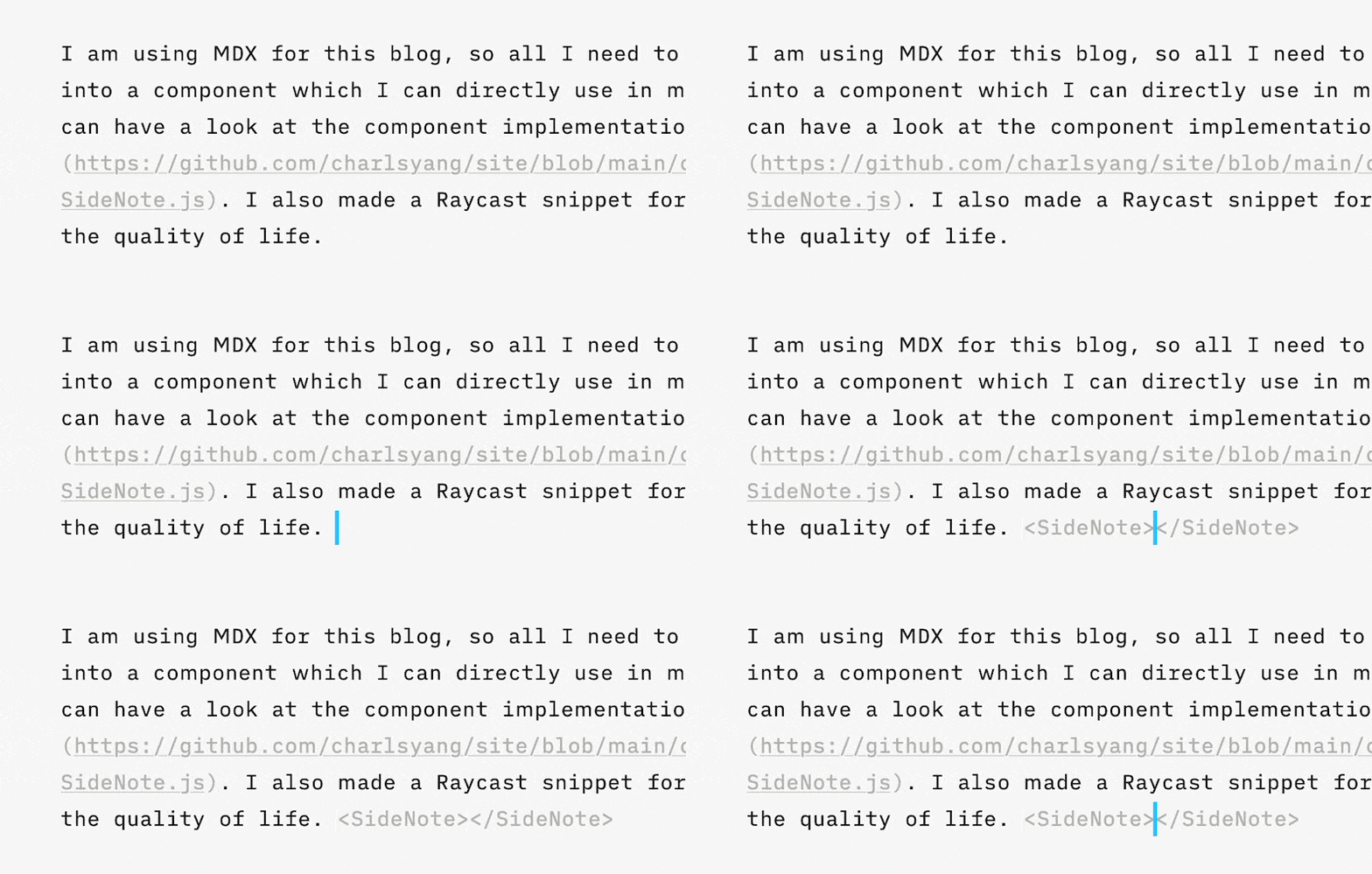
I am using MDX for this blog, so all I needed to do is to turn the sidenote into a component which I can directly use in my writing. I also made a Raycast snippet for it to improve the quality of life.

Something that got me stuck for a while was that I didn’t realize I needed to have id and for attributes on <input> and <label> so that users can interact with the <input> by clicking on the <label>. Rookie mistake, I know. But at least I am sure I am going to remember this for good. As there could be multiple sidenotes in a blog, I used a bit of JS to create a small helper function that generates unique ID dynamically. You can have a look at the component implementation here.
Now, next step. One thing I am not quite satisfied with is how the label will potentially break into the second line, causing the number detached from the annotated text. I tried adding a non-breaking space in the component but didn’t quite work. One solution is including the annotated part in the component, as Koos does, but my sidenotes are not always commenting on a specific trunk of text and it will also add a bit of overhead to writing (like passing words as props).
I also like how Gwern and Koos’s sidenotes have a style change on hover to show the connection between labels and notes. I’d probably consider adding something like this. The web is interactive!