In Teaching to See, a documentary that pays tribute to Inge Druckery, Inge’s students told a little story of her use of reducing glass:
...she would put our composition on the floor and then she would stand on a chair with this little reducing glass, so that she would get essentially thirty feet from the composition which allowed you to see relationships much more clearly. So she would stand up there on the chair, again, towering over me and look at the composition and she would say: “I think the two letters are not the same weight.” And I’m looking at it, and I’m saying: “Yes, they are the same weight. I’ve measured them.” But optically, they weren’t the same weight. So I learned the differences between geometric accuracy and optical accuracy.
Optical accuracy is not the same as numeric accuracy. This is one of the first lessons I learned as a designer. Two things are measured to have the same length or weight doesn’t always mean they look the same.
“Like all two-dimensional shapes perceived by the eye, letters too are subject to the laws of optics.” wrote Jost Hochuli in Detail in typography. He went on, “The decisive element in assessing their formal qualities is thus not any kind of measuring instrument, but the healthy human eye.”
Hochuli discussed some optical facts to watch out for in designing letterforms. Here’s one:
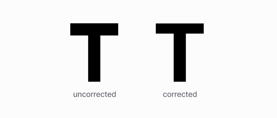
For a given weight of line, a horizontal line appears heavier than a vertical line. To achieve optically balanced verticals and horizontals, which appear to be of the same weight, the horizontal must be somewhat narrower.
This is most exemplified by the capital “T”:
Optical effects like this abound. Take the primordial interface element, button (Note: Highly recommend this article that covers more optical effects in user interfaces.). For button with both text and icon, the icon side will appear to be heavier because of the icon’s heavier weight, and thus needs to have a smaller padding than the text side.
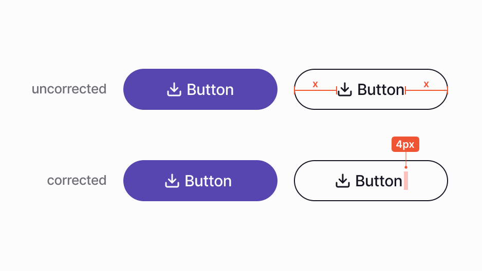
The asymmetry could be subtle, a few pixels often suffice. The key is that optical adjustment of this kind rarely has right or wrong answer. It all comes down to if something “feels right”. This gut feeling, or trained taste, is captured by a lovely German word: Fingerspitzengefühl, or “finger-tip-feeling”. Another example in typography, from iA:
Whether I set a text’s line height to 100% or 150% is not a matter of taste, it is a matter of knowing the principles of typography. However, whether I set a text’s line height at 150% or 145% is a matter of Fingerspitzengefühl; wisdom in craft, or sophistication.
More than anything, the design should feel balanced and comfortable to the eye. Trust your eyes more than numbers.