This post is part of the blog series that documents my design process of a Visual Communication class project.
This week (the week of Apr 18, I kept procrastinating on making the images. Finally, here it is, now I need to go back to more meta-design debt...) I was mainly exploring the mobile layout of the site and making some poster “wireframes”.
Mobile Layout
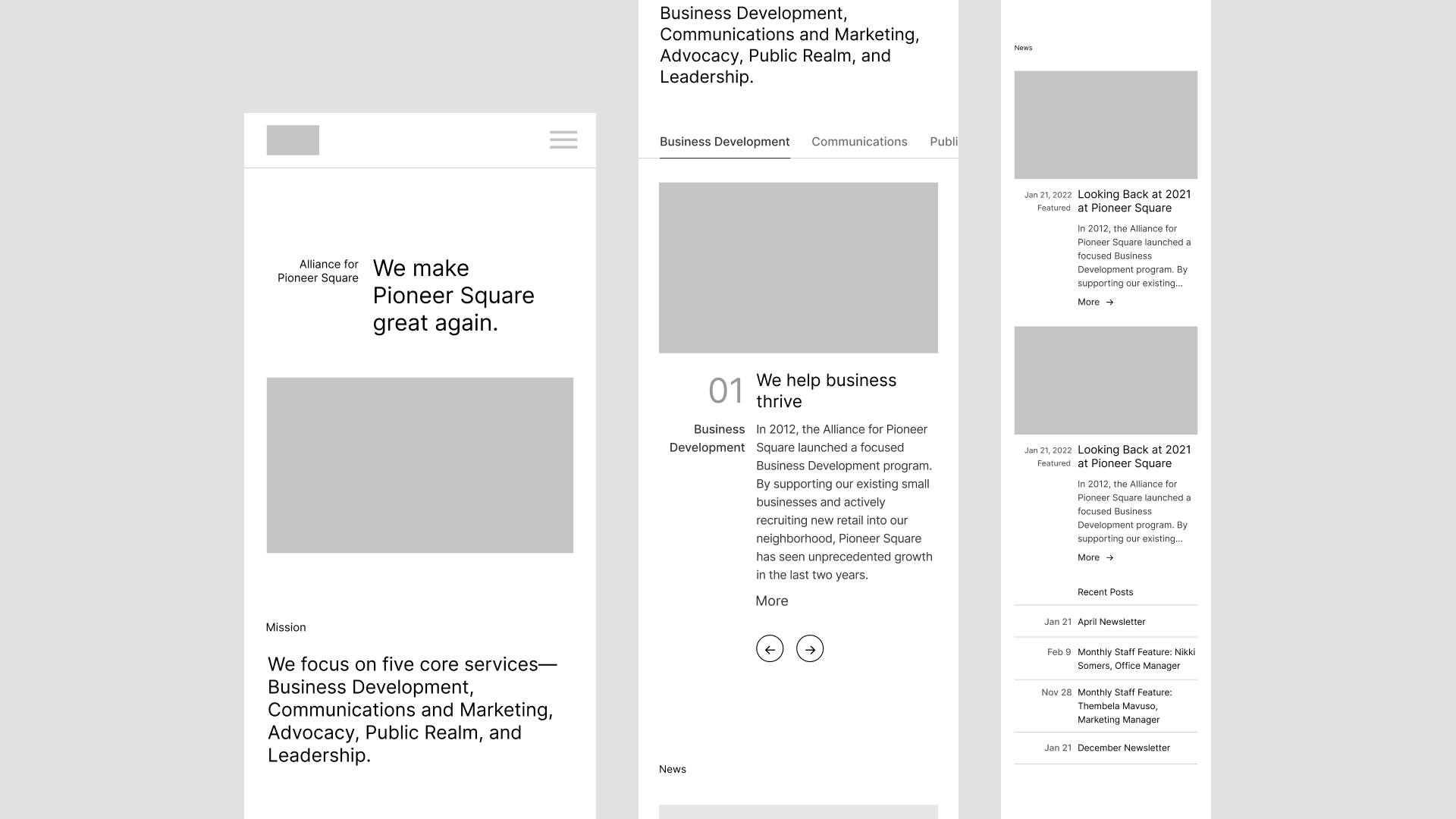
Working on mobile has always been a pain. With so limited screen estate, I’ve been wondering—how not to just stack things over each other in a single column? That’s easy and safe, but boring. Compared with my interesting layouts on desktop, the single-column is lackluster. My goal, therefore, is trying to retain as much essential traits from desktop layouts as possible.
For the axial version, I use a three column grid to have the axis remained at 1/3. And yes, even taking up two of the three columns, text blocks still feel squeezed too narrow. Not entirely sure about that. Another thought is that for the main service section a horizontal scrolling might work better than tabs—it makes more sense as now we have a touch input.
And for asymmetric it’s even harder. The signature asymmetric margins just don’t make too much sense on mobile, so only the indentation pattern manages to survive. Still five columns and one-column offset, gutters & margins adjusted accordingly.
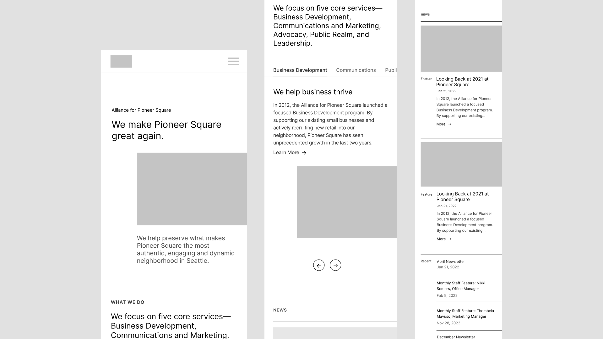
Four columns feel like working better. Moderate variation, appropriate line length, not excruciatingly dull. Maybe I can go back and add more columns to the axial one and see how it works out.
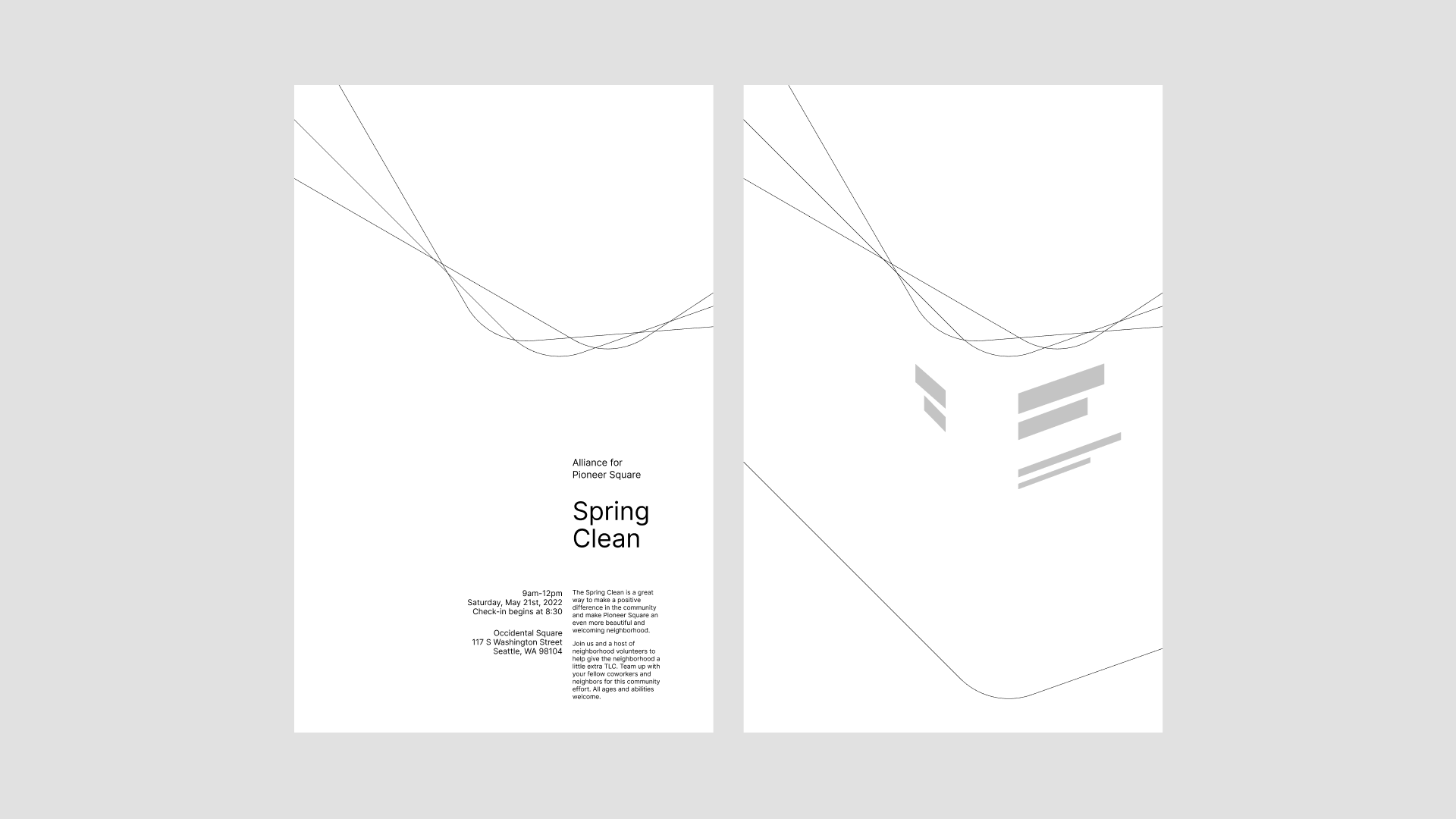
Posters and Patterns
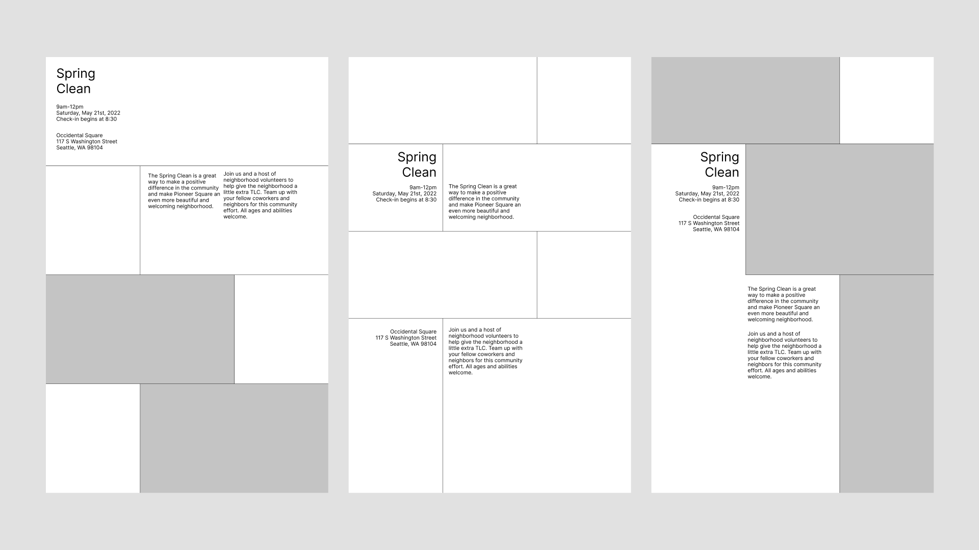
I found it pretty hard to appropriate the concept of wireframe to graphic design. What would be a “mid-fidelity” poster look like? It seems to me now it’s not enough to only have types and images. I need to have some sort of overarching “visual concept” that cuts across different mediums, something that could provide a flexible structure for extending communication channels.
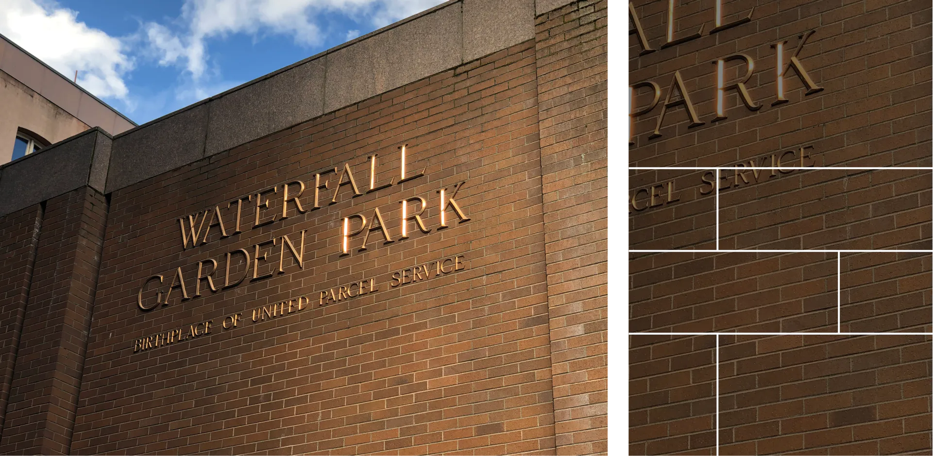
I sourced my inspiration from Pioneer Square’s architectures: the arches, the bricks, and the corners.
The Arches
One dominant feature of Pioneer Square’s Renaissance Revival style buildings is the Roman arches.
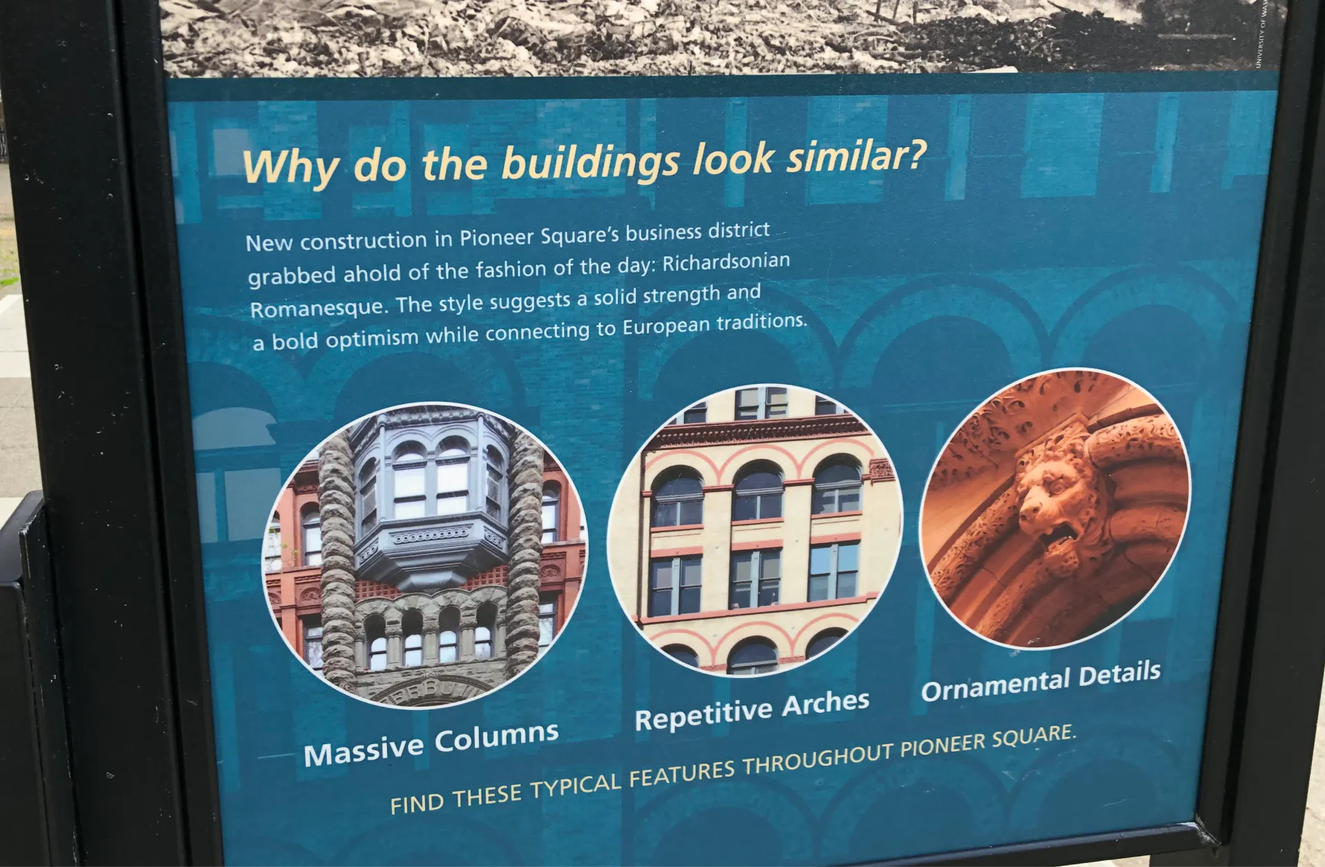
So I was thinking about singling that feature out, abstracting it, and making it a consistent pattern throughout.
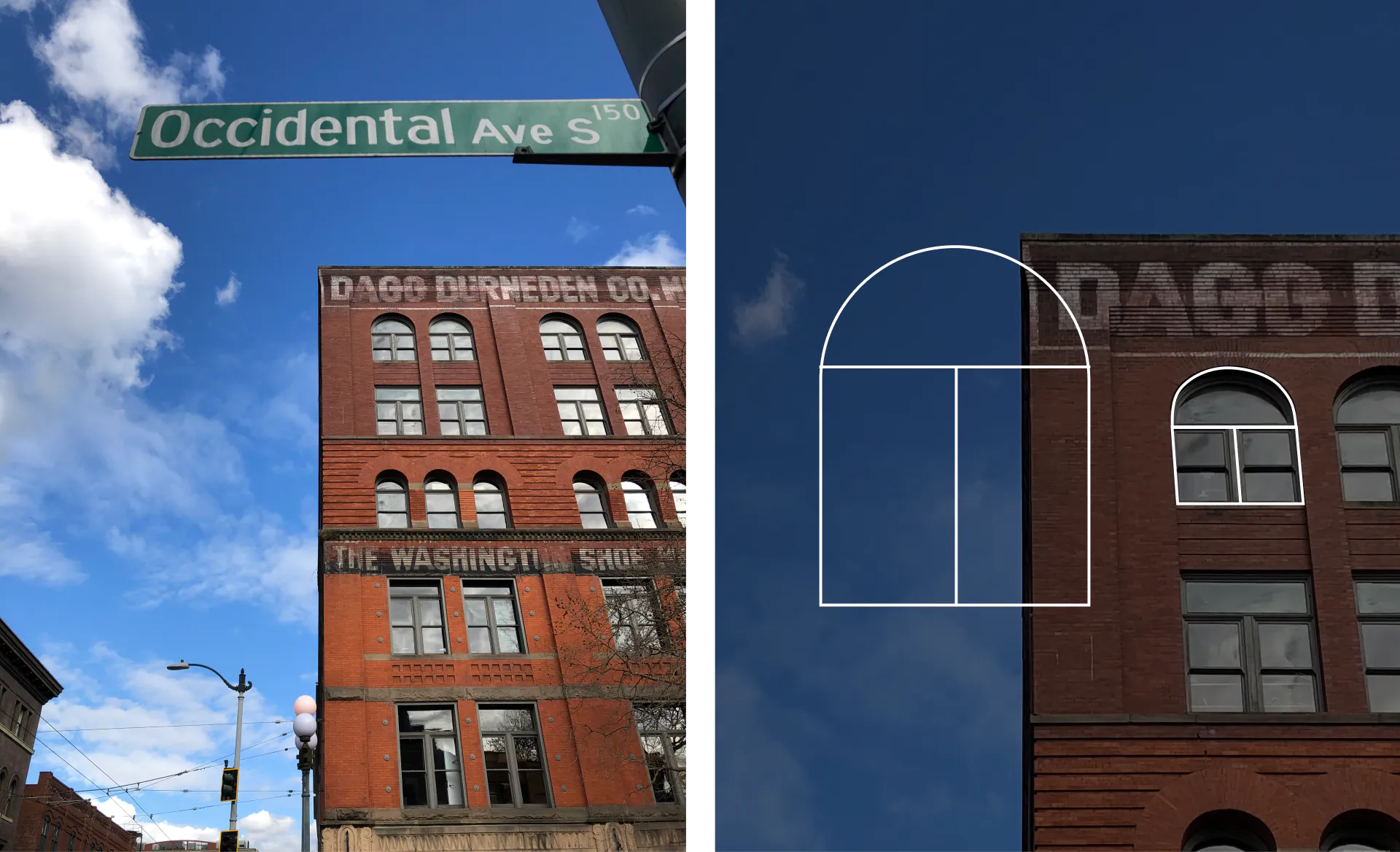
The arch could be a versatile device for organizing elements. Here it serves as a griddy skeleton for distributing texts and framing images.
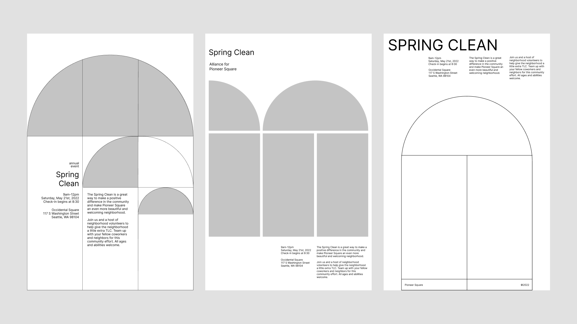
It can also be small repeating patterns for decoration. I decompose the arch into primitive shapes (ellipses and rectangles), playing around with different combinations to look for interesting patterns.
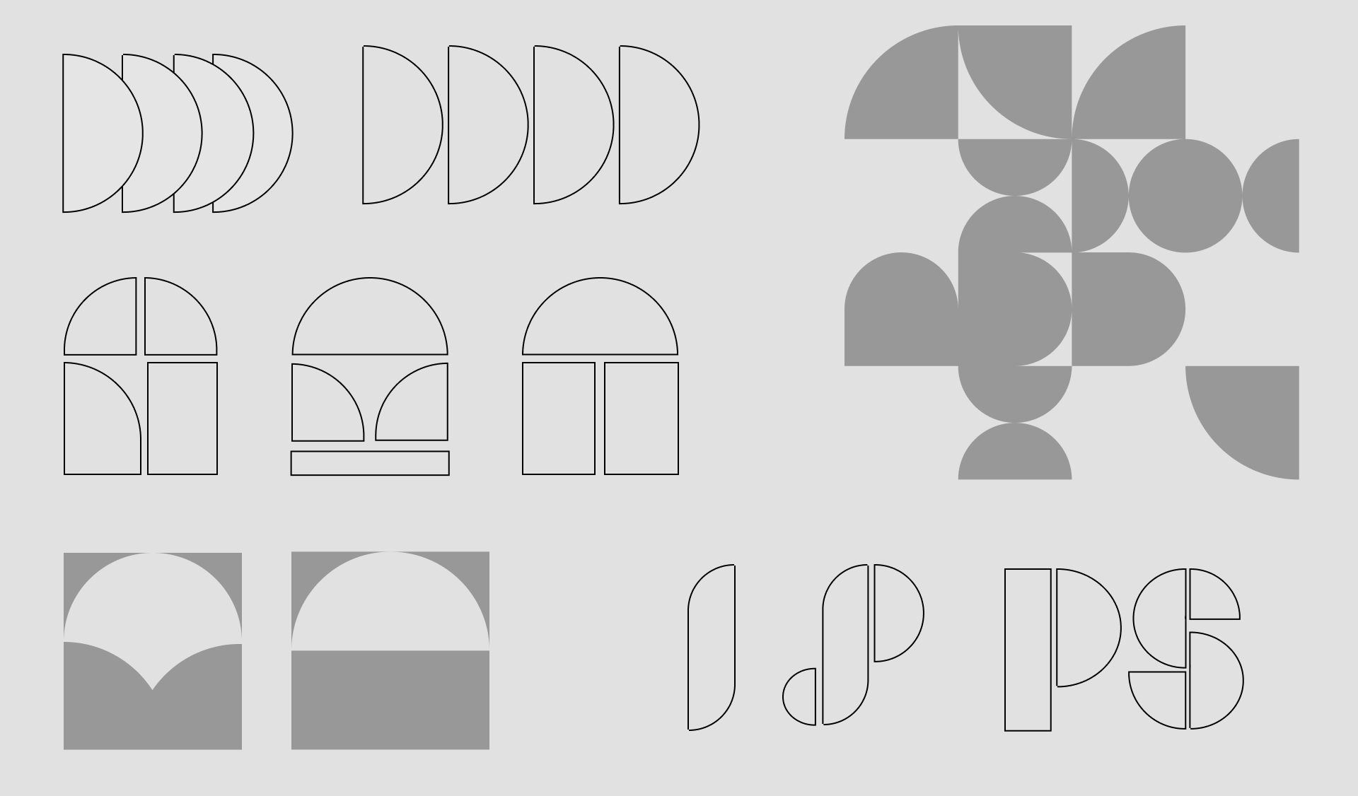
The Bricks
Another idea comes from the pattern of bricks. Maybe by taking a small part of it and zooming in, these pattern can also serve as an overall structure.
Nothing remotely fruitful. I decided to exclude this concept in the critique session.
The Corners
In the pictures I took I also noticed several buildings have this soft, rounded corners that contrasts their otherwise hard and sharp lines. I extract that out and play around with it.
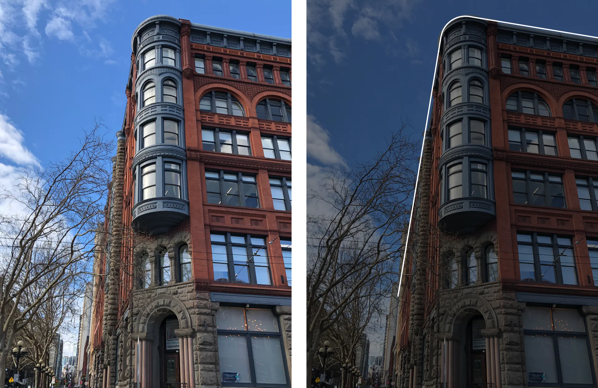
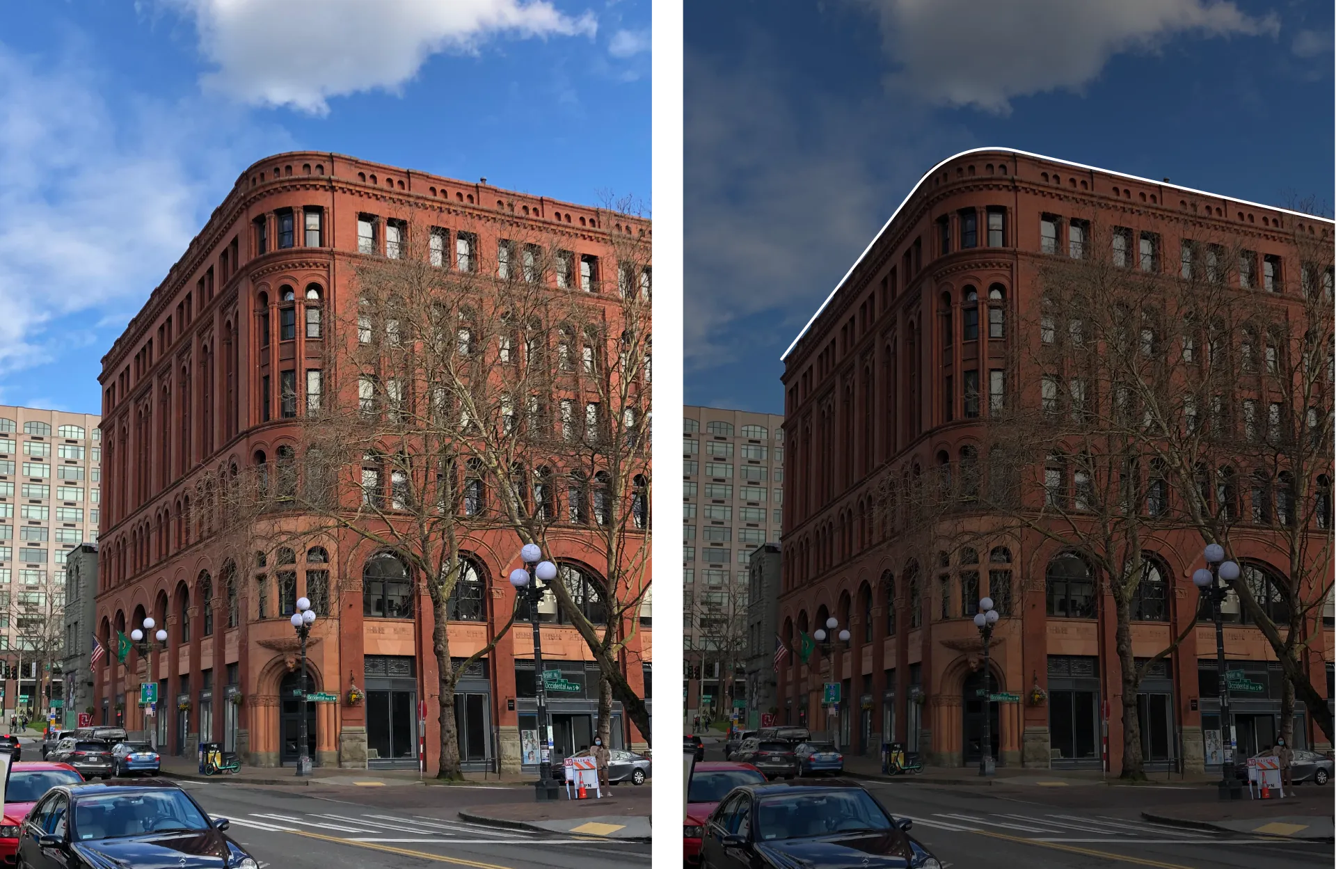
This concept is less well received during critique. As one peer commented, it is too abstract and less of a signature of the buildings, which makes its association with the neighborhood weak. But I figured that these overlapping “corners” could serve well as a subtle background pattern.