This post is part the blog series that documents my design process of a Visual Communication class project.
Next comes one of my favorite parts in typography: grids. We are going to define a grid system for the site based on the secondary research and moodboards. Given that my two moodboards differ little in direction, I don’t have to choose one for now.
Content
Before anything else, I need to sort out the content—without which any serious forms could not be built. I did a simple audit of the current site and recorded every section and navigation item in FigJam. After a bit of arranging and merging, I pinned down the content sections for Homepage and About page.
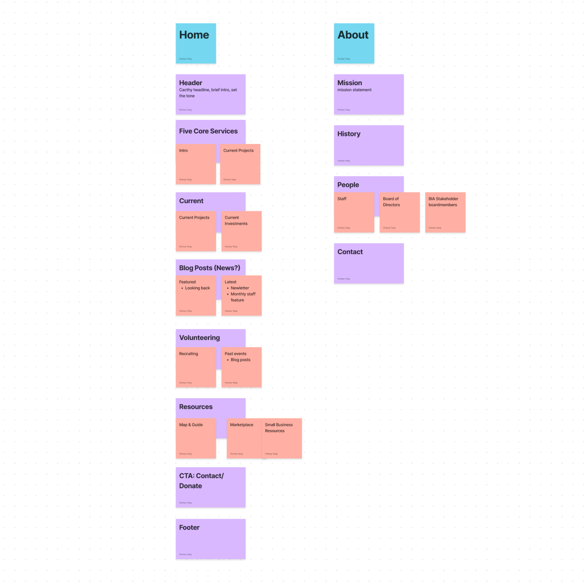
This is indeed a good place to do some light card-sorting activities with relevant stakeholders to see what each party regards as more or less important. But since this is a visual design class that focuses less on research, I’ll rely on my best judgement.
First Draft
As a start, I put the content together with the most banal layout I can think of. It’s an ugly first step to start thinking about the priority of content and spatial relationship between elements.
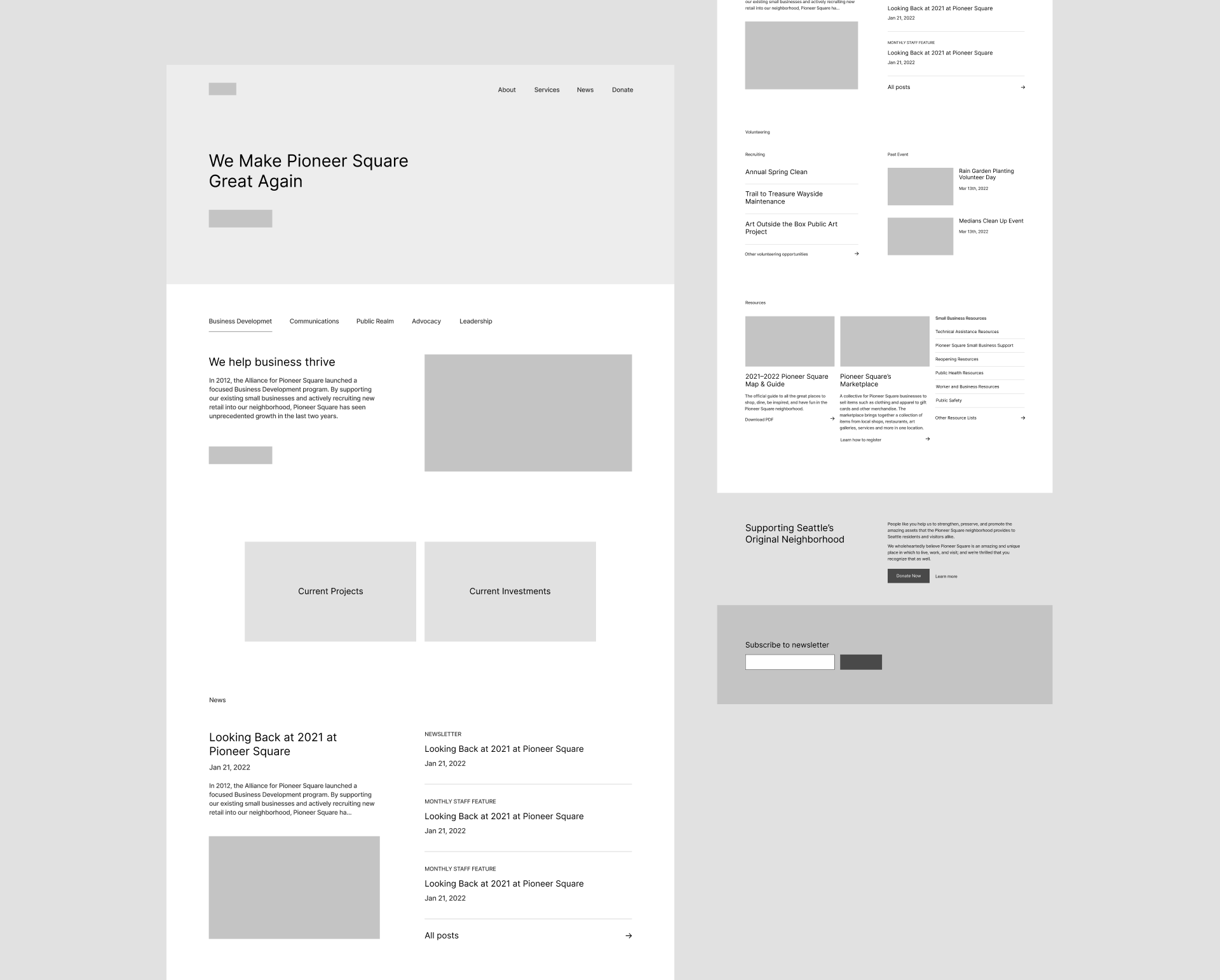
The process is painful not only because I am aware what I am putting down is hideous but I also have to refrain from every urge to improve it. It’s too tempting to jump ahead of myself and make things better.
Sometimes this could be paralyzing. The fear of not being able to produce anything that I aspire prevents me from even getting started. However, everything has to start with something. Creators of any sorts learn to live with the crudest beginning and proceed with a joyful relief knowing that anything follows will only be finer.
I put down all the content of homepage at first, but soon decided to only move on with the first few sections in order to iterate faster. After all the purpose here is to grasp how different grid constructions feel and several sampled sections should suffice.
I explored four types of grid system in total, though the first three are merely varied usages of a good’ol 12-column grid. Let’s dive in.
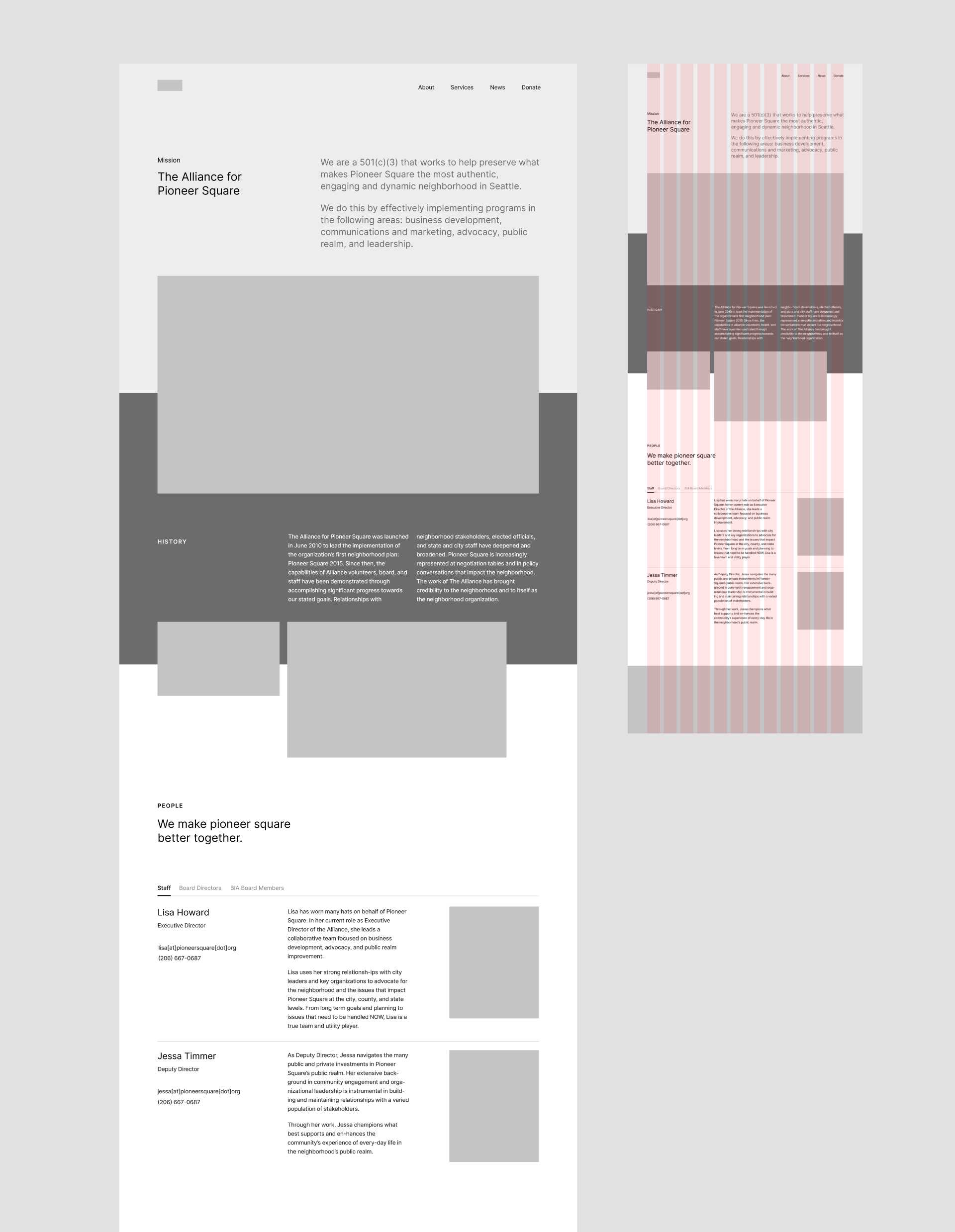
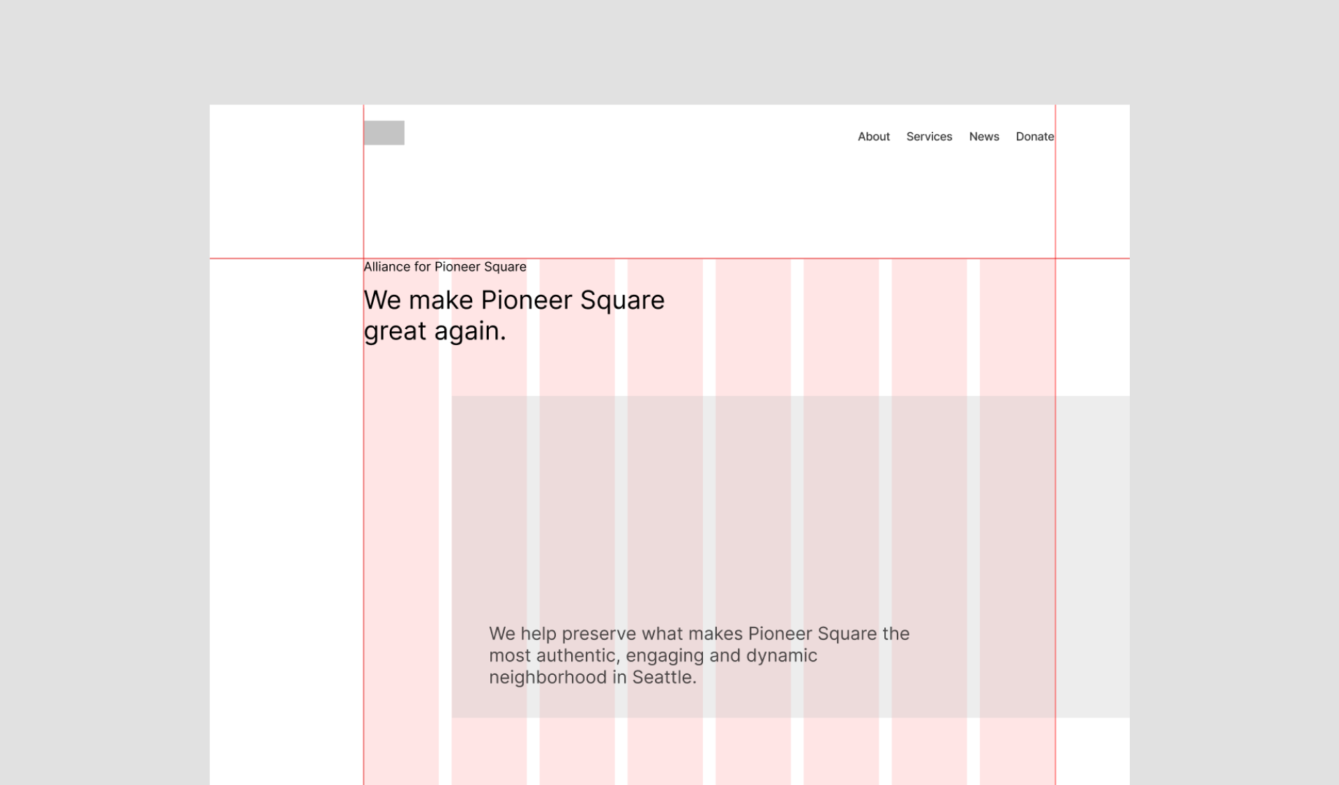
Classic
I have a hard time naming the first one, mainly because it’s what comes to my mind first and doesn’t bear a particular theme. So there it is, “classic”. It’s standard, formal, and organized. A more intentional arrangement of the first draft.
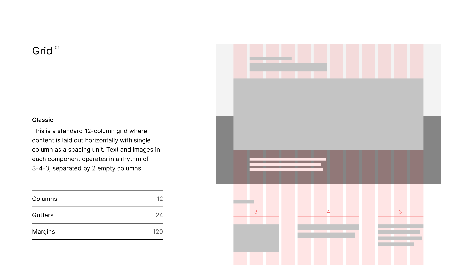
Other than the 3-4-3 rhythm, one prominent feature of this direction is that it uses colored backgrounds to divide sections, with pictures cutting across different sections to facilitate the transition and bring in a bit more dynamic.
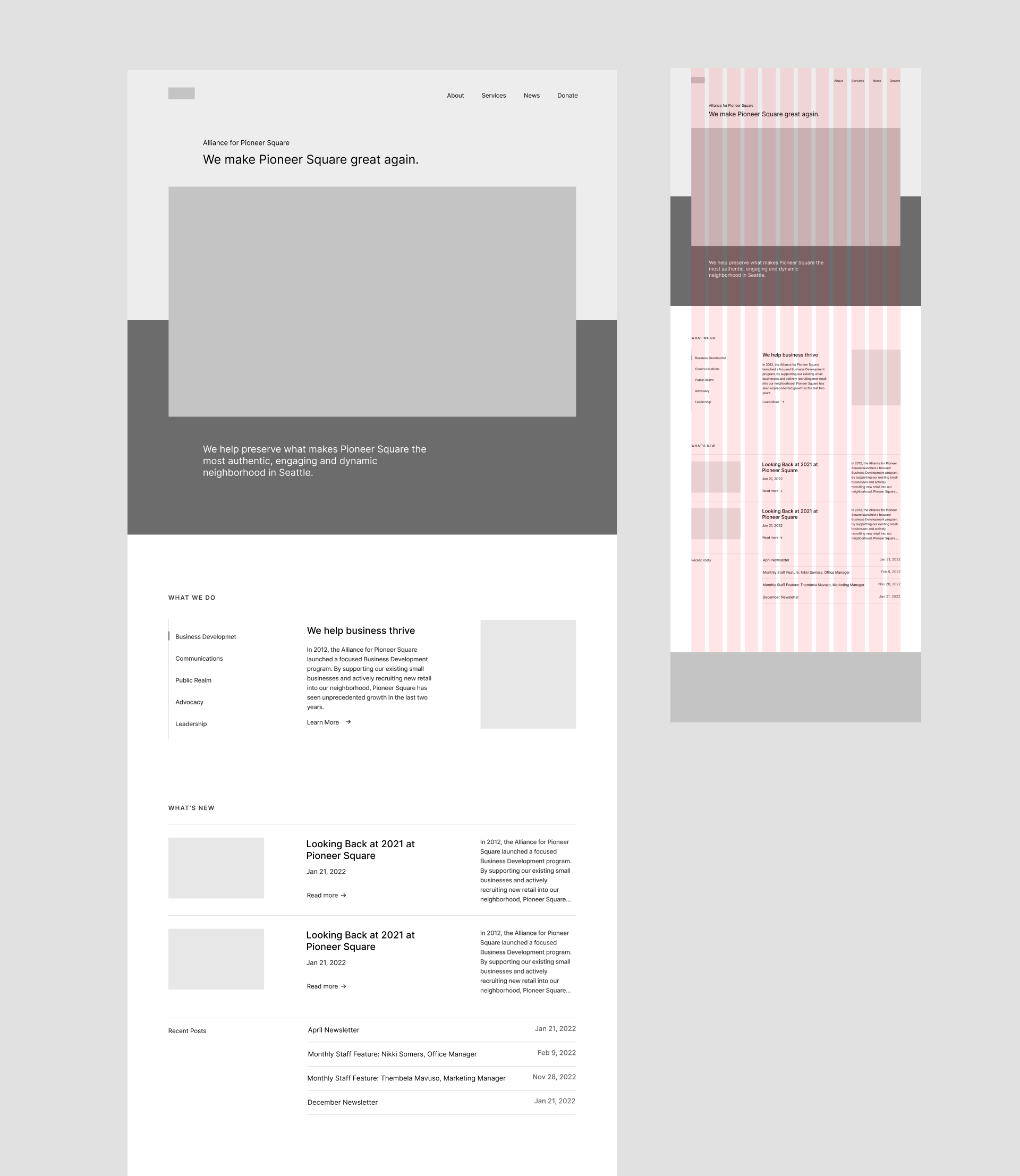
This is what the About page looks like:
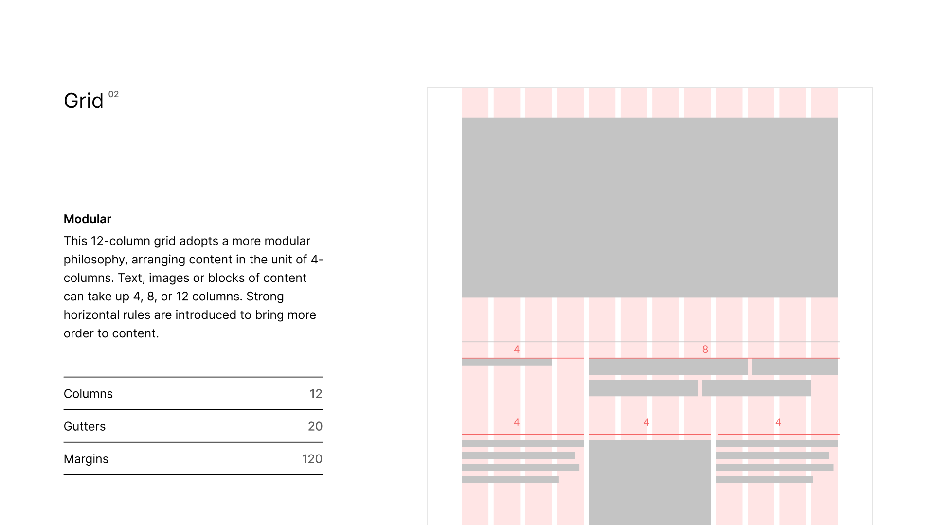
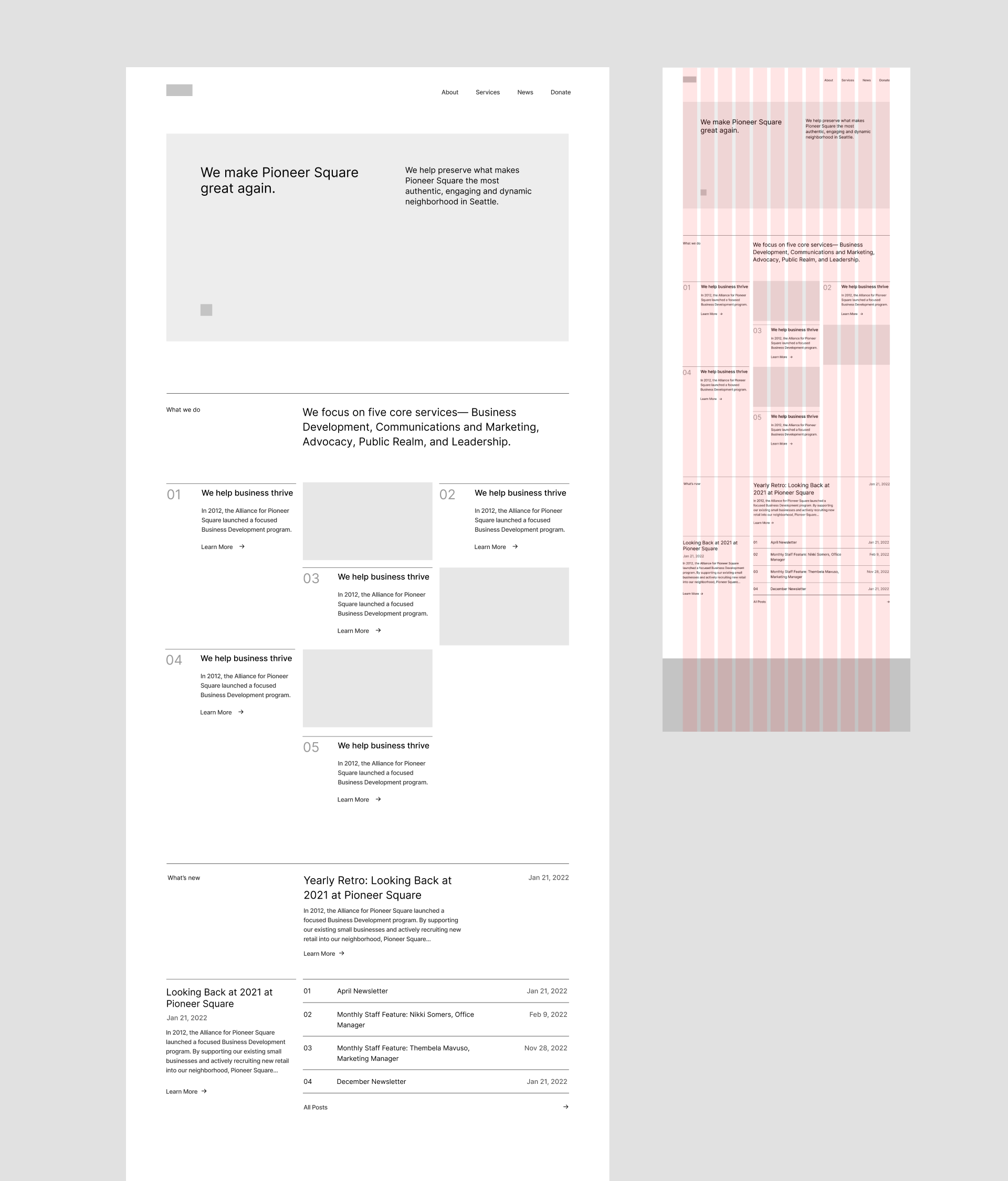
Modular
Although rows are not so common for grids on the web, I wonder if I can use the same idea to organize contents into typographic blocks:
We have a big blocky header, five main services plotted on a 4×3 modular grid with some imagery interludes to maintain a rhythmic balance, and blog posts divided into three levels of hierarchy with each one in its own weighted block.
It looks...ok. But there’s something not quite working here. The 6-column wide section heading feels too tight, and the negative space created by empty blocks is fragmented and stifled—trapped in small rectangles craving ventilation.
What’s more, the overall layout looks a bit too organized and uniform. Operating on the basis of 3 in a 12-column grid means that elements either take up 1/4 or 1/2 of the space, i.e. the space is divided evenly. And evenness, unfortunately, engenders embarrassment.
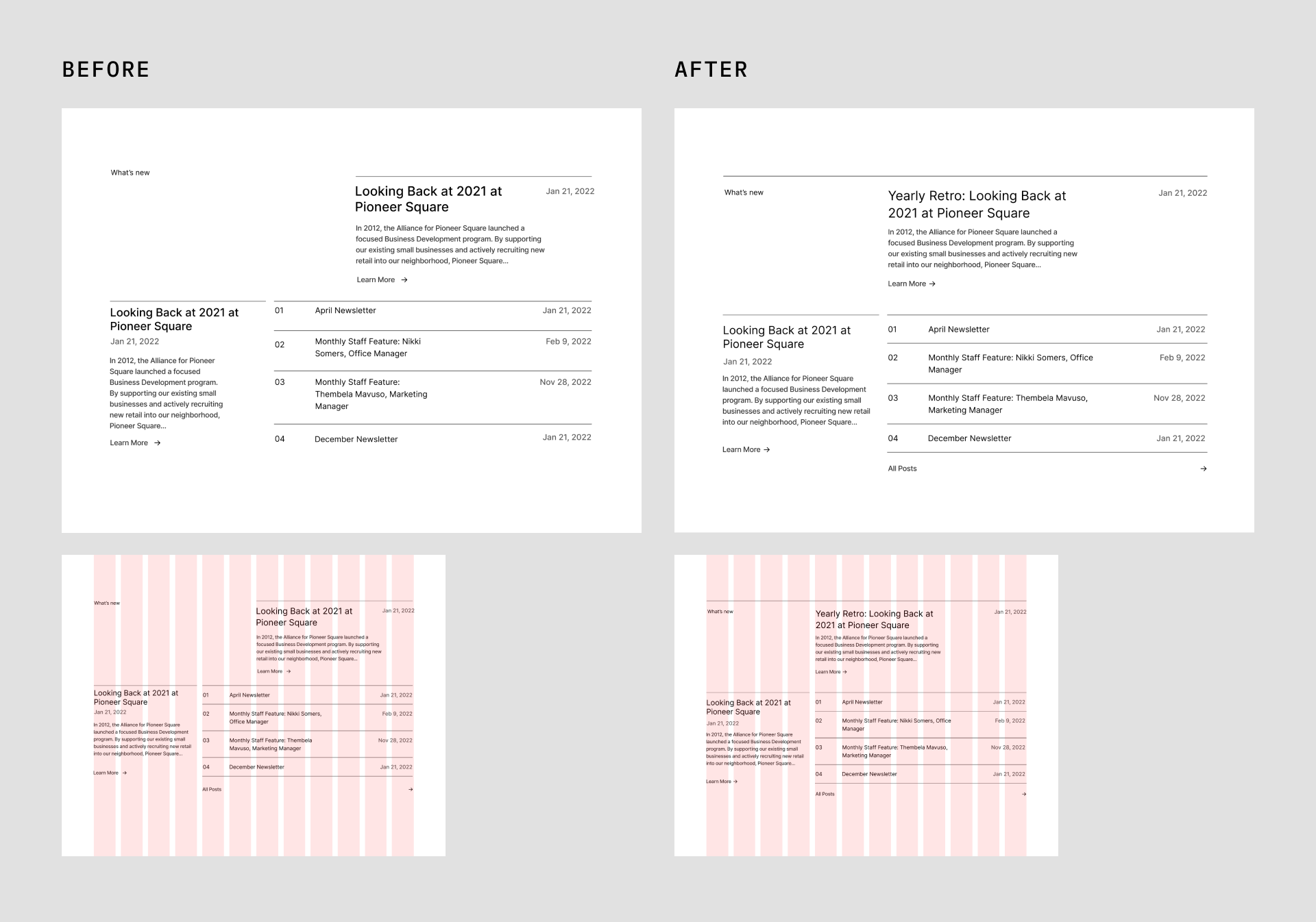
Also—as you might have caught me, the second row of the blog post section actually breaks the rule to assign different weights to different hierarchies. The second featured post takes four columns and recent posts eight.
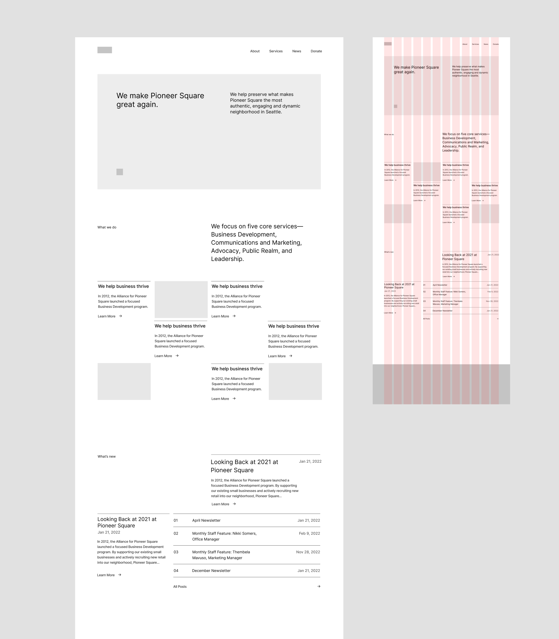
So I change gears to use a unit of four columns, essentially dividing the space into three parts. Now the modular grid of main services becomes 3×4, and I introduce numbers as a small device to tilt that scale of balance a bit further.
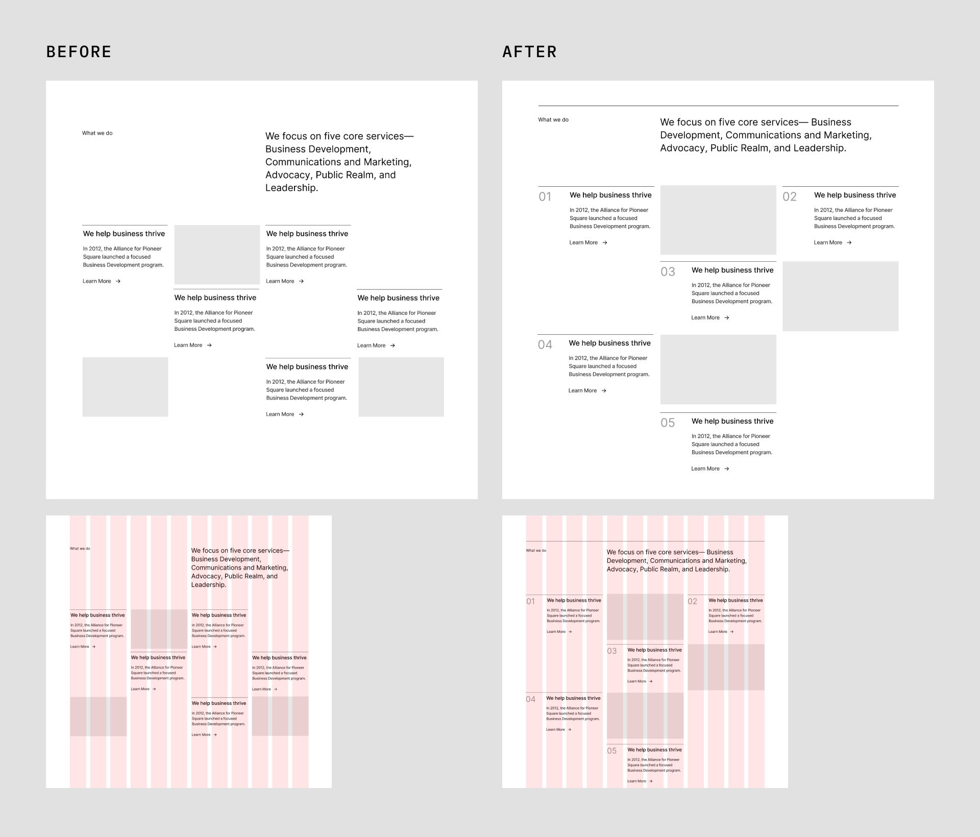
Much better. Less cramped and ample room to breathe. The revised blog posts section also properly lines up, with the first featured post taking up eight columns.
As you have probably noticed, I also introduce horizontal rules for each section to bring in more order and consistency.
Here’s the result of the second grid:
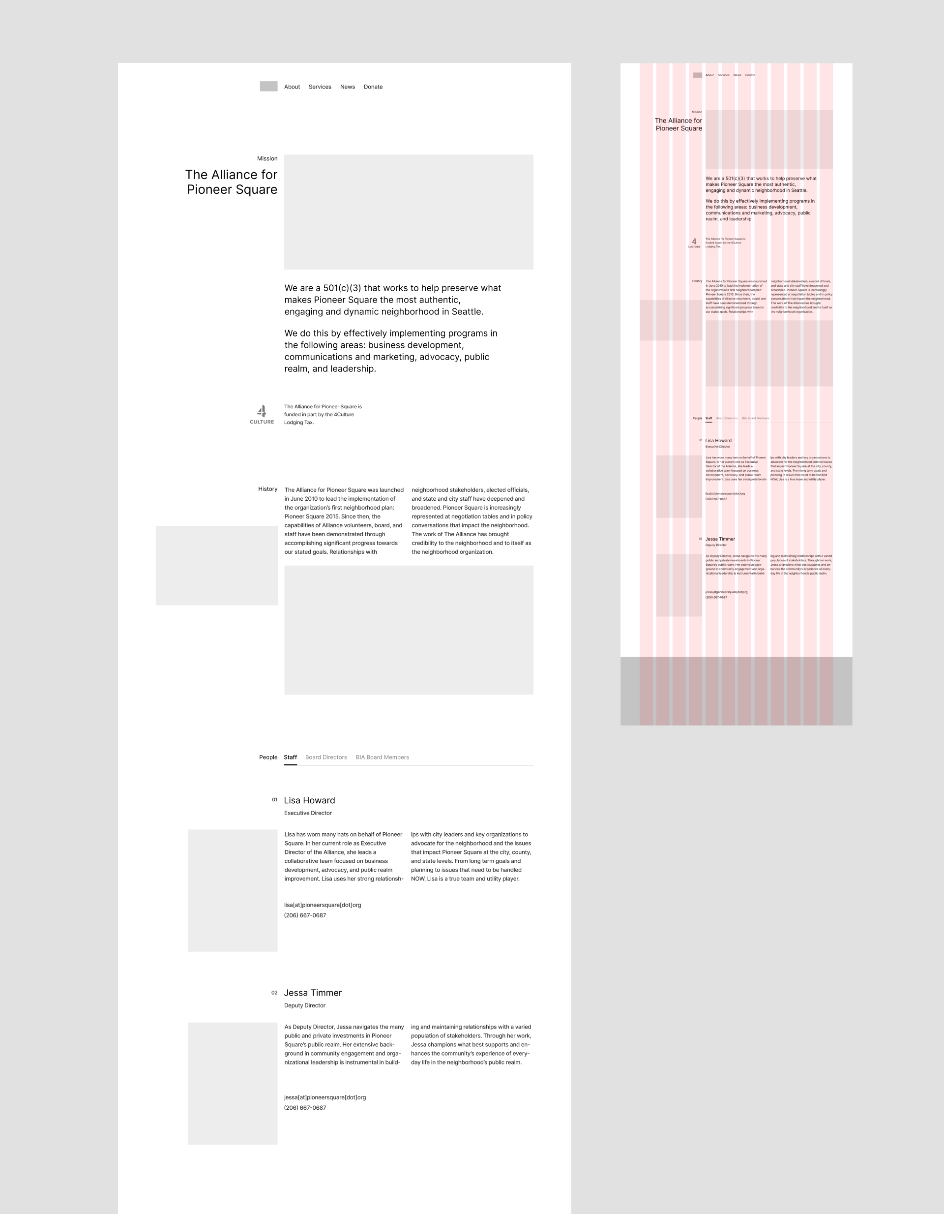
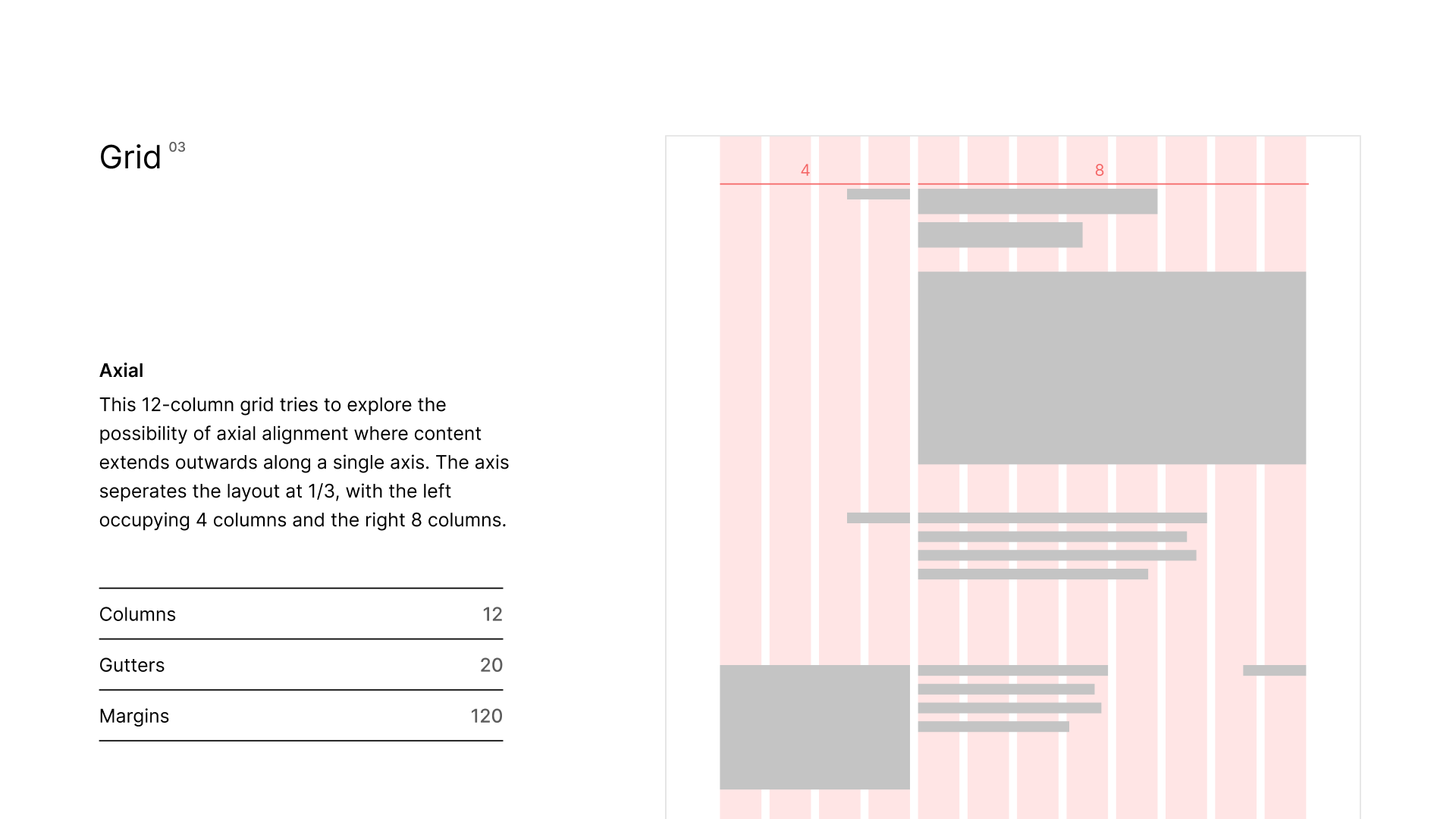
Axial
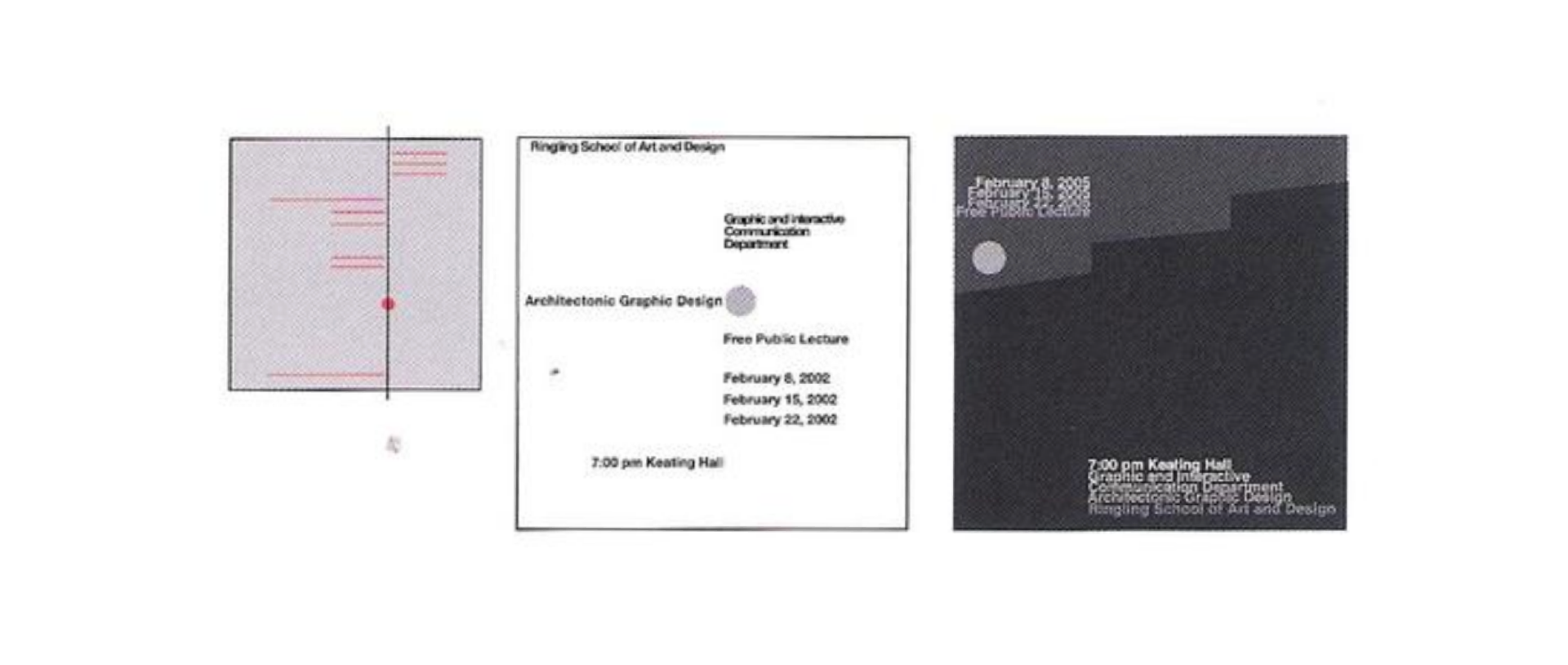
In Typographic Systems, Kimberly Elam introduces an Axial System where all elements are organized either to the left or right of a single axis.
For this grid I explore the possibility of applying it to the client’s site. I first used a 16-column grid with the axis at 1/4, so the left side accounts for four columns and the right twelve.
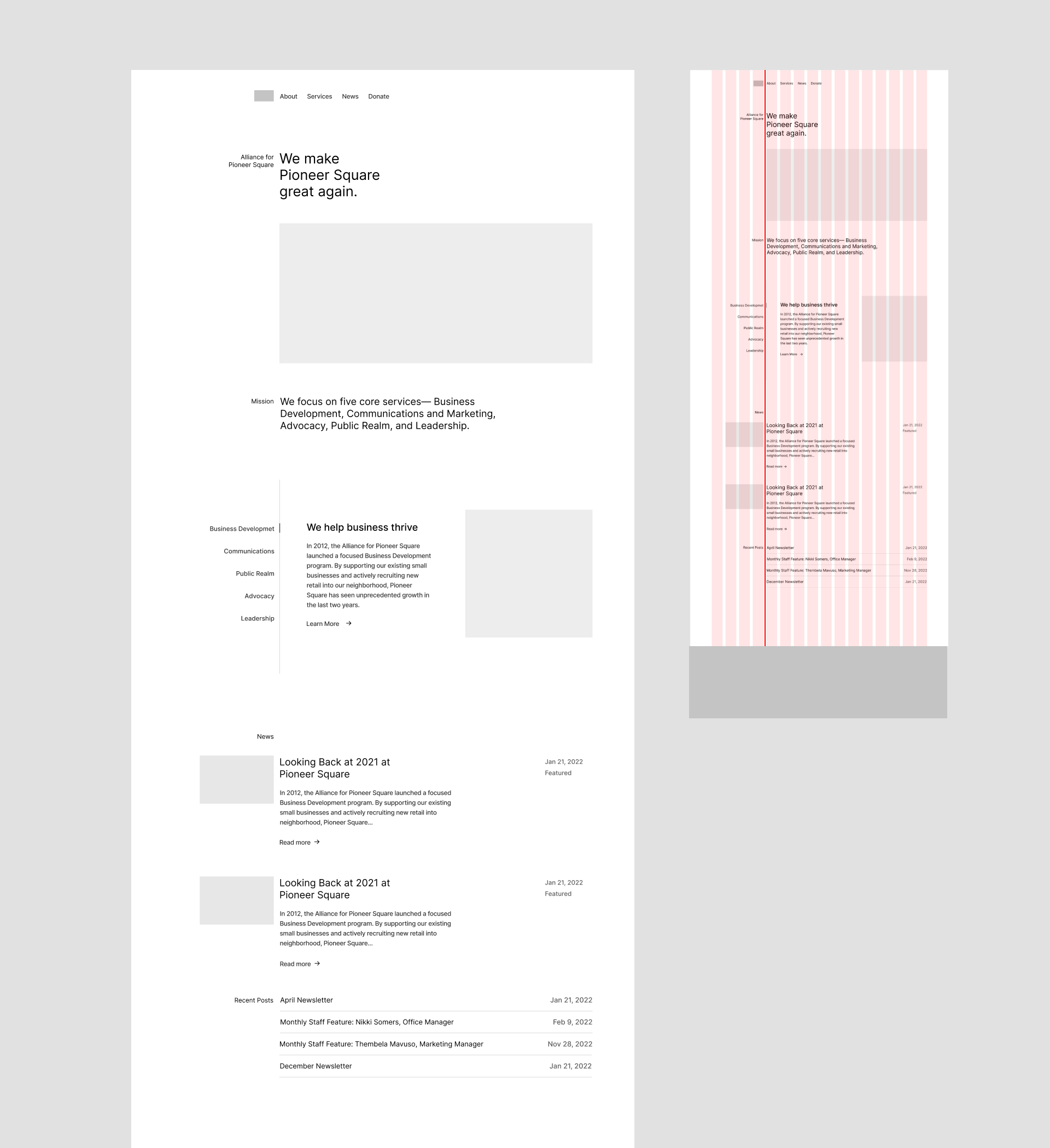
Not bad! The proportion feels a little off, though. The left side of the axis is too cramped with all weight falling on the right. Let’s try with 1:3 instead of 1:4. I fall back to a 12-column grid, and it looks more balanced:
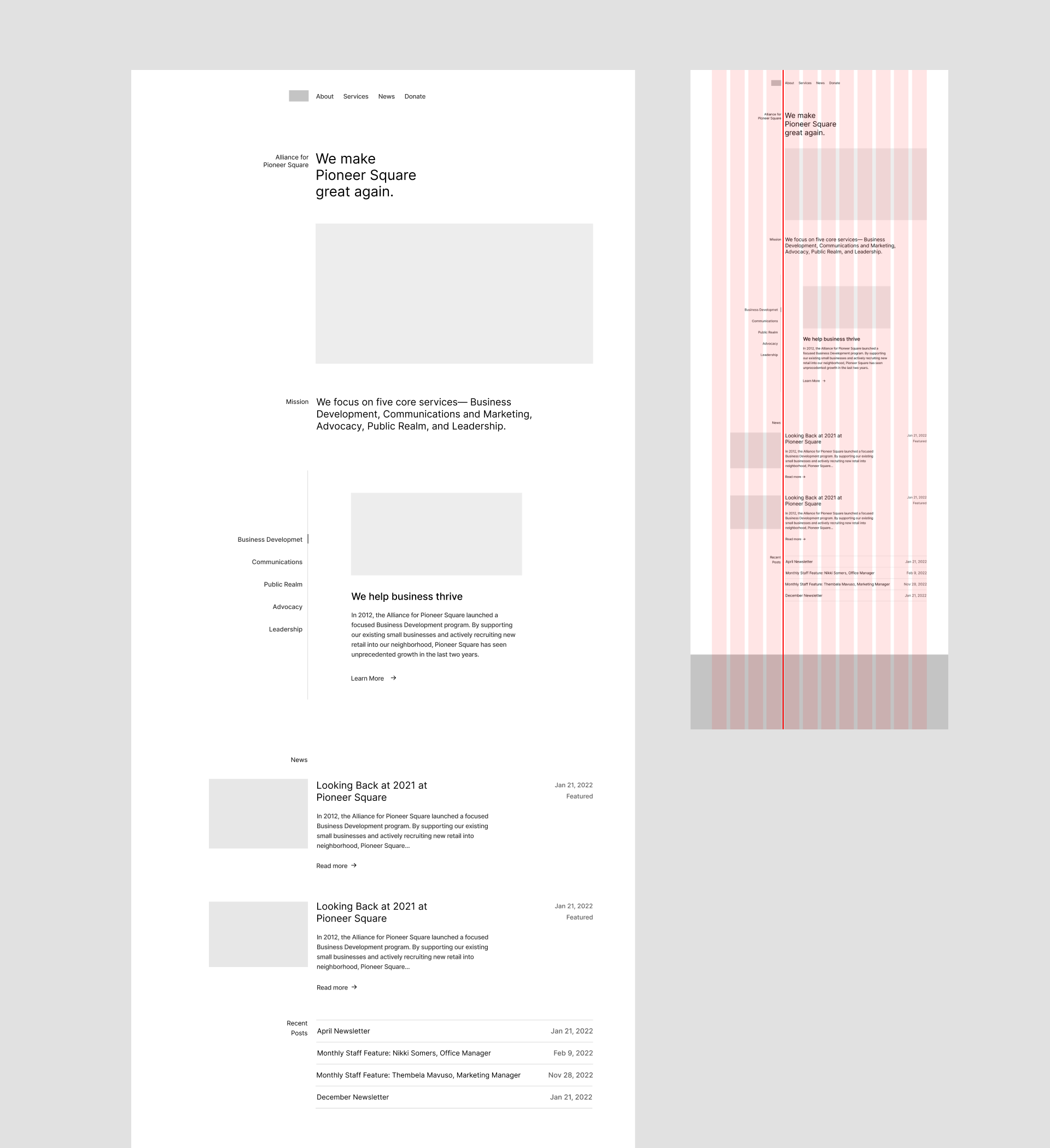
And this is how the system applies to the About page:
Wrapping up with some documentation:
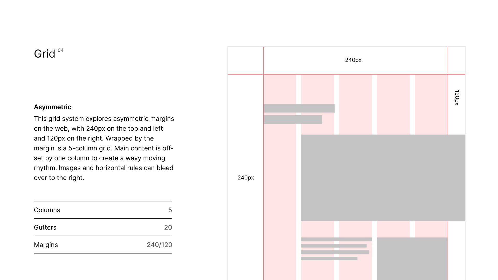
Asymmetric
Asymmetric margins are common in print but rather rare on web. Maybe by appropriating such treatment I can somehow emulate that editorial feeling on client’s site.
Since Figma doesn’t support asymmetric margins, I need to create guides manually. It’s easy to do a responsive column grid with a row of rectangles set in auto-layout. Each rectangle has its height and width set to “fill container” and the gap can be adjusted as the gutter. The only problem is that I no longer able to show or hide grids using the handy ^ Control + G shortcut.
I set a margin of 240px on the top and left and 120px on the right. Wrapped inside the margin is a 8-column grid.
At first I came up with quite an interesting layout with this grid.
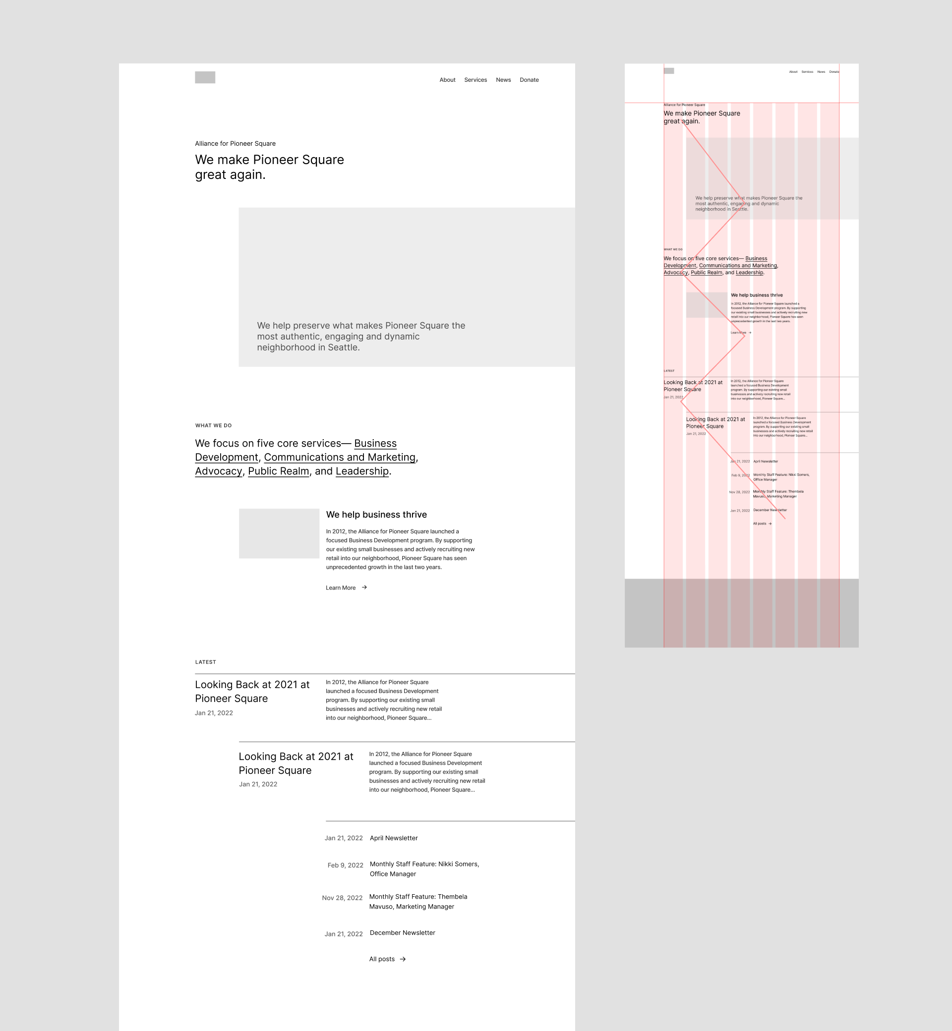
The content inside each section is indented, and the indentation increases with each row, which results in a zig-zagging pattern flowing downwards like a stream. The ever-shrinking width of content creates an accelerating velocity.
Despite interesting, it apparently does not align with the dependable neighborhood steward image I am up for. I need to bring some order back. Instead of incremental indentation, I opt for a consistent one to stabilize it.
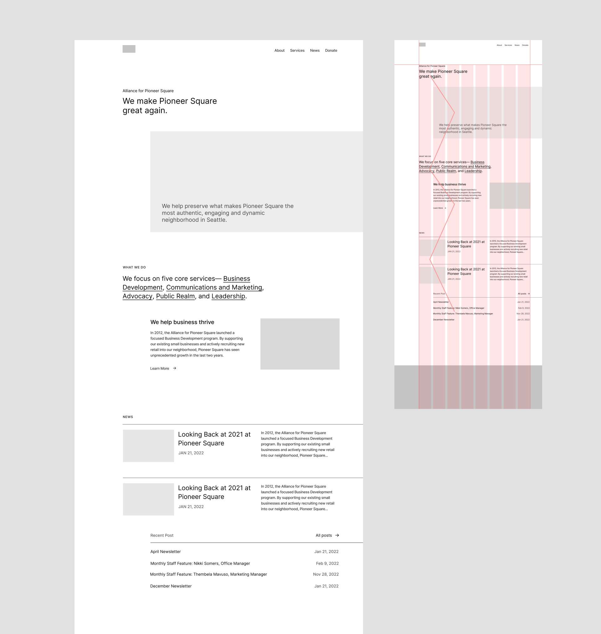
It’s less crazy, for sure. But now that I look at it, 1/8 column indentation seems inadequate. I wonder if I can increase the off-set to bring in more contrast. Therefore, I reduce the column count from eight to five. Reduction for wider columns, five so that indented content sits on an even number that is easy for further subdivision (sorry I lied about the latter part, I used five only because I’ve never used an odd number of columns and wanted to try :P).
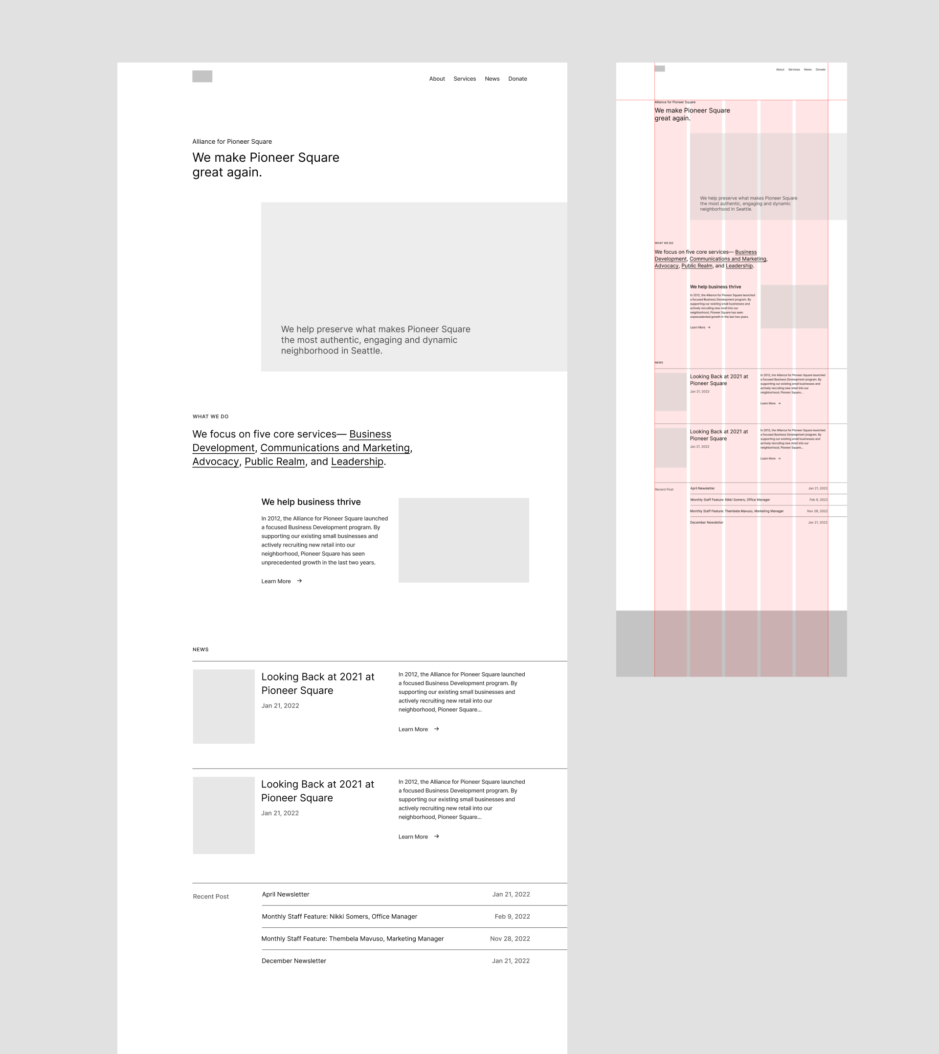
The potential downside of this move is that the larger indentation might break the connection between section heading and content a little bit.
Here’s the final documentation:
Feedback & Next Step
Okay, this is way longer than I expected! Just a brief conclusion before we end. From peer critique someone said the Modular grid feels too modern for my client, which I agree. So that rules it out. And the Classic grid is safe and...boring. I’d prefer to pursue something more outlandish while I still can. For now I am still wavering between Axial and Asymmetric, which to go is yet to decide.