This post is part of the blog series that documents my design process of a Visual Communication class project.
Based off the background research, I developed two moodboards that describe potential design directions.
To briefly restate the communication goals, the new visual system should:
- Have a distinctive voice that aligns with the positioning of the organization and the cultural identity of the neighborhood
- Prioritize clarity and accessibility, charting clear paths for a diverse set of stakeholders
- Communicate a sense of trust, position the organization as a credible and professional “neighborhood steward”
Informed by the first and the third goal, both moods use subdued colors to convey stability and dependability, as you’ll soon see.
Classic/Historic
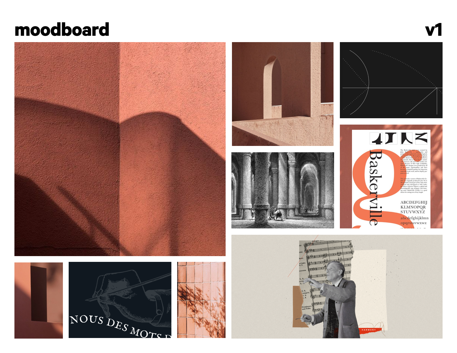
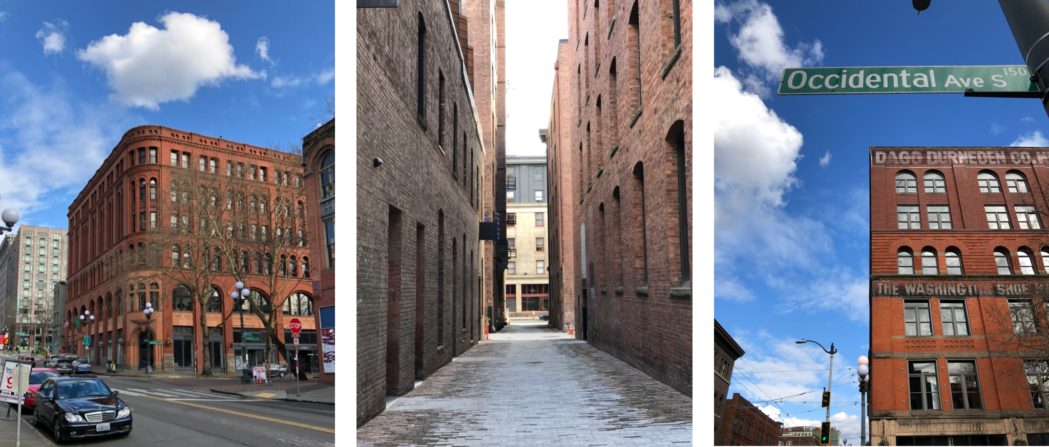
I visited Pioneer Square the other day to get a sense of how it feels to be around the neighborhood. And what lingers in my mind till today—as any tourist sites will tell you what’s representative of Pioneer Square—is still the buildings: Renaissance Revival architectures with their dull red bricks that is one of their defining characteristics.
Therefore, this first mood draws inspiration from the square’s emblematic architecture.
- Texture: grainy and coarse surface of worn bricks
- Color: desaturated pinkish red, coupled with off-black and beige (or pure white)
- Lines: hard geometric lines that intimates the edge of buildings and the pattern of brick walls
- Type: old-style or transitional serif
- Imagery: some old book illustrations, collage with monochrome photography
Poetic/Artistic
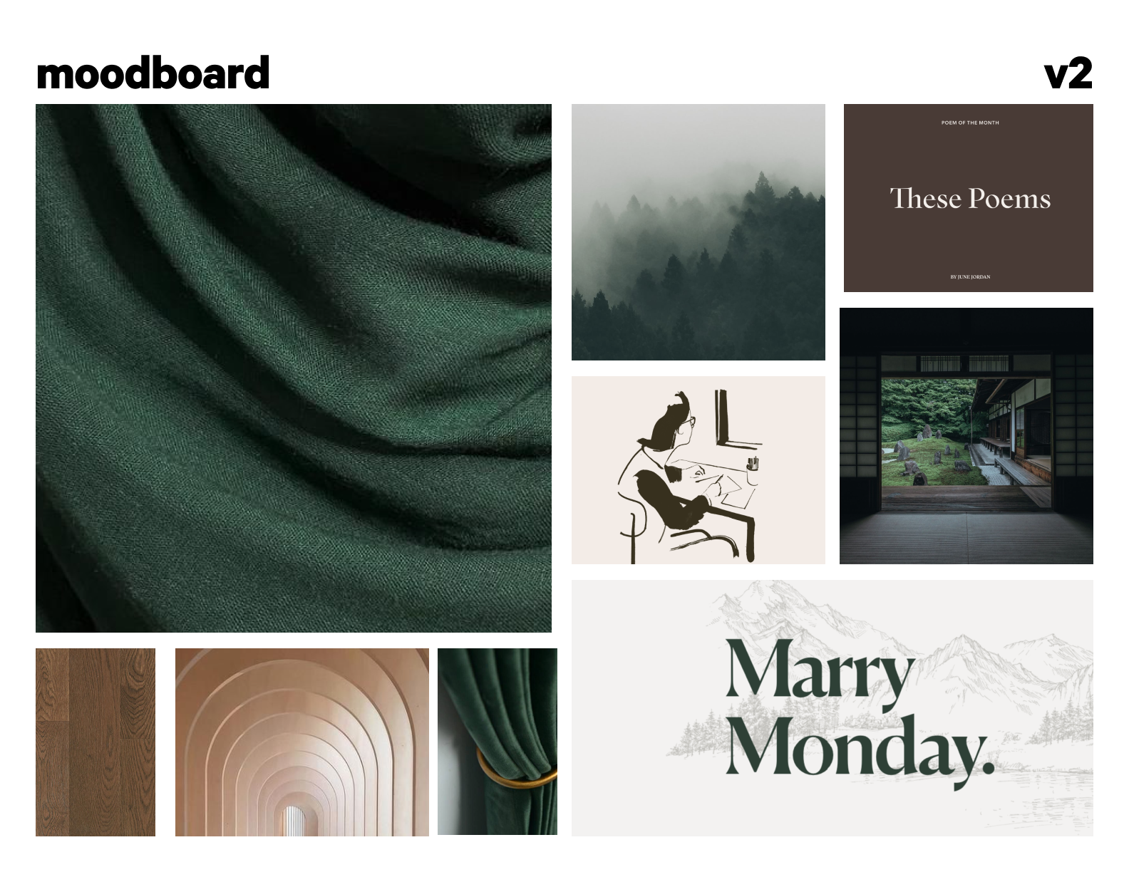
For this direction I would like to highlight the artsy side of Pioneer Square, a place where many galleries cluster.
- Texture: smooth fabric, woody
- Color: dark green with a tinge of blue, biege(or white), and an earthy tone
- Spacing: airy, with lots of room to breathe
- Line: soft, curvy line as the folds of cloth
- Type: more modern, elaborate display serif this time, probably paired with some sans serif body text?
- Imagery: sketches, organic hand-drawn illustration
Reflections
Upon reflection, the two moodboards are not distinctive enough, mainly because I only started one hour before the deadline (I mean, who doesn’t procrastinate?). The first direction came early and naturally, but for the second—due to short of time—I didn’t define keywords beforehand. Instead it was born out of a cursory and desperate attempt to draw it apart from the first one. As a result, it inherits more than it diverges, looking like a descendent rather than a counterpart.
Another concern is the second editorial style being too “higher-up” and classy, carrying a slice of condescendence that goes against the “steward” image which was more “down-to-earth”.
Critique from Instructor and Peers
Unsurprisingly, the first reaction is that they look too similar. Both of them use serif and feel elegant. I might want to explore more type choices, using a different font such as a bolder geometric sans serif.
There are, of course, a variety of different ways to create trust with type. For example, something inorganic and mechanical like IBM Plex Sans or one of those skinny bulky display font can both be interpreted as steady, pragmatic, and trustworthy.
However, the challenge lies in presenting the organization as dependable while preserving a connection to the historic and artistic cultural aspect of the neighborhood. Taking an overly modern and rational approach could potentially throw off the latter part of the identity.
Another note is on color. Maybe expanding the color palette a little bit more, bringing in two to three colors. They also feel too soft right now, whereas the vibe of Pioneer Square is more punchy and vibrant. A classmate suggested incorporating colors from the Smith Tower baroque interior.
Aside from my rationale for color above, I do want to mention again that the difference in vibe is a conscious decision because of the difference in audience.
While the Pioneer Square serves visitors and the general public, the Alliance of Pioneer Square deals with a complex web of neighborhood stakeholders. But to what extent should the identity of Pioneer Square and the identity of the Alliance differ (or resonate) remains as an open question.
Next Step
I’d probably continue to explore more possibilities with the second one. I also have in mind an alternative direction that takes the big bold slab serif from the Pioneer Square identity and pairs it with some bright primary colors and dark backgrounds. That’s a style that I am not so familiar with, so should be to play around with.