Over the summer of 2022, I worked as a Product Design Intern at Rubrik’s Design System team and was responsible for the visual and interaction design of the design system website, helping refine and further develop the design language that shapes the look and feel of the site. Shown here was the first phase of the project.
Branding
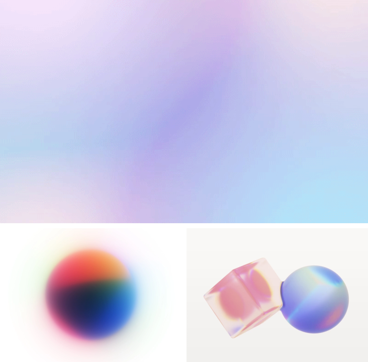
Building on a design language that’s balanced, spacious, and iridescent
When I joined the project, we already had a branding direction set for the website (moodboards below are credited to Binan Zhang). We have a working landing page designed by another designer.
I was originally responsible for improving the interaction design on the landing page. However, I see an opportunity to elevate the visual design as well and took the initiative to do design exploration.
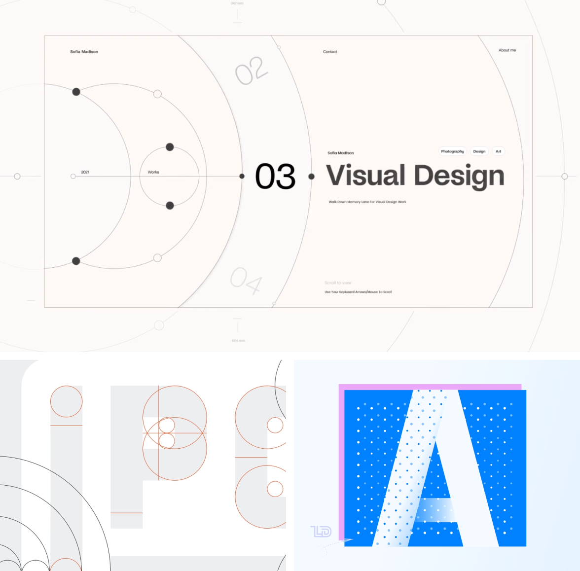
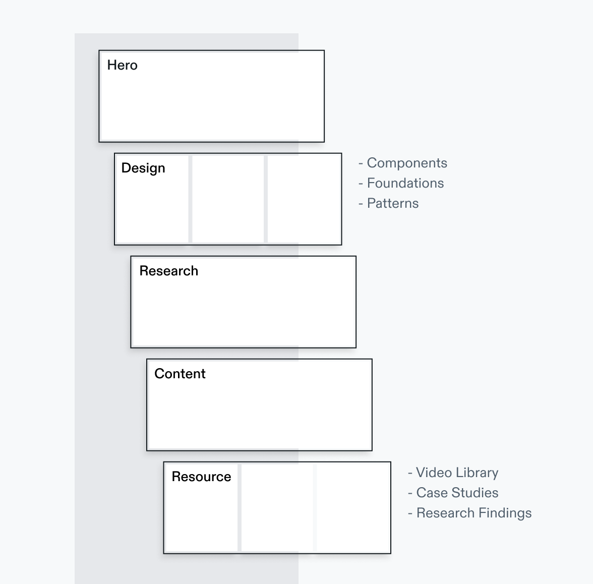
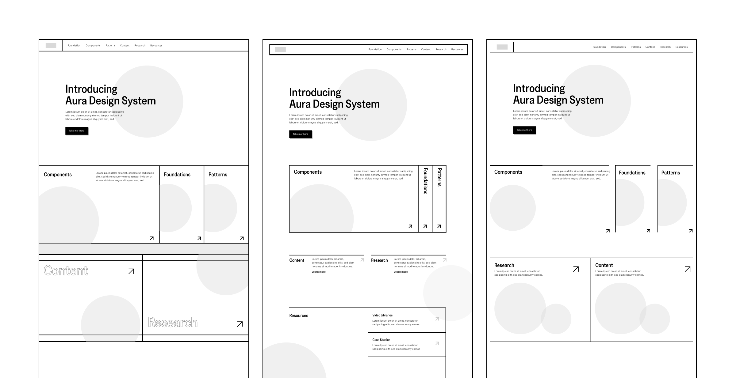
Layout
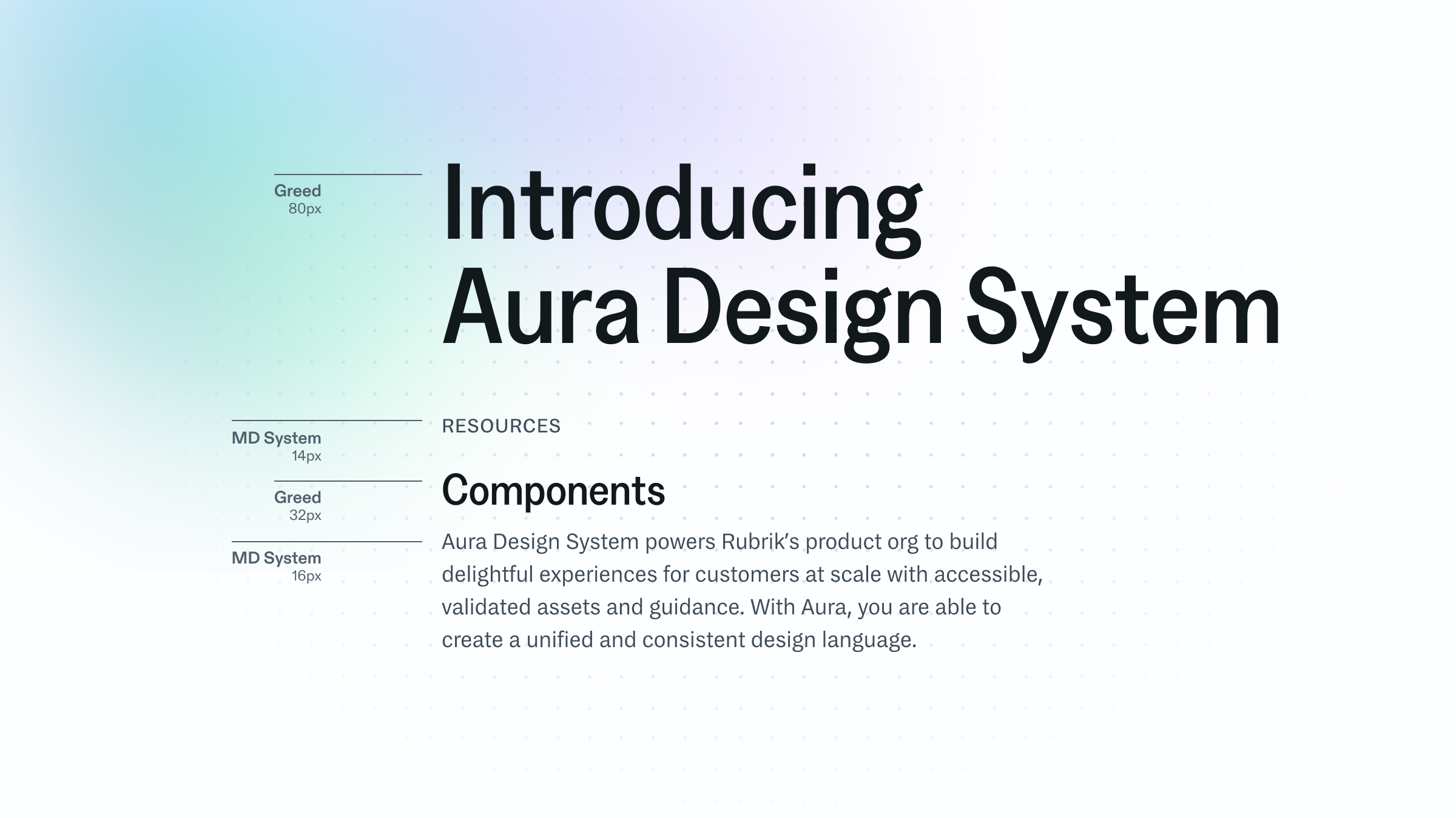
Extending the “system” concept to an edge-to-edge explicit grid
I took the concept of “system” even further and extend the dividers into an explicit grid that encapsulates the content. I explored different versions: an edge-to-edge closed grid, an open grid, as well as something in-between. The team was in favor of a closed grid.
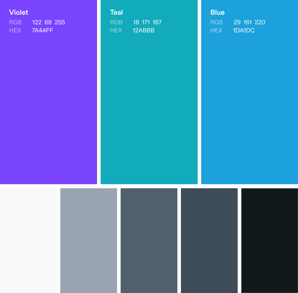
Typography
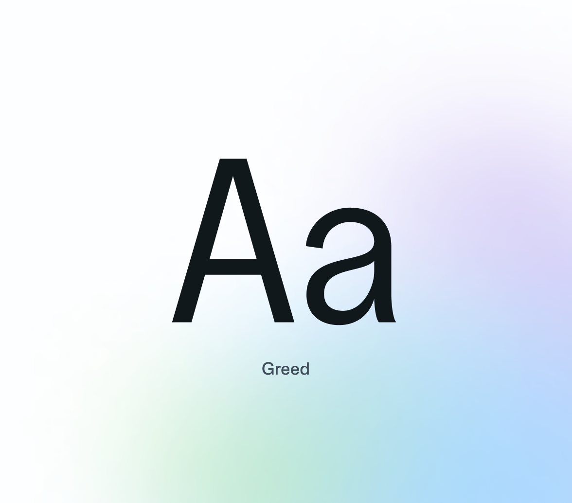
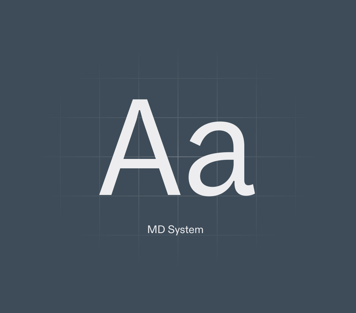
Pairing a lean and modern type duo
Open Sans Condensed was originally used for the headline. As its optical size is not optimized, it looks chunky and blunt in large scale. I felt an imperative to search for an alternative display typeface, as well as something for the body that matches it.
Serendipitously, I stumbled across two typefaces that, albeit from different foundries, pairs perfectly with each other.
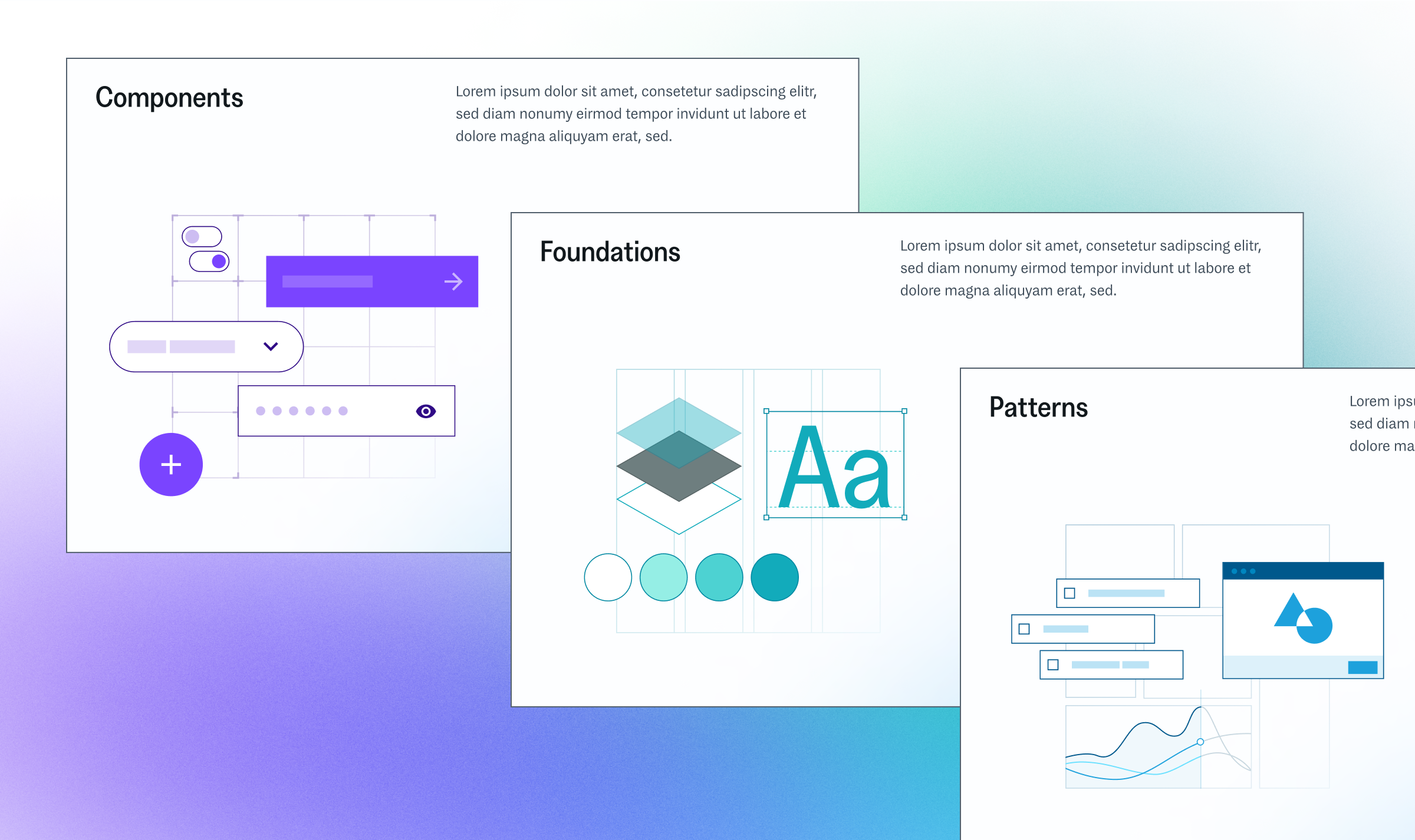
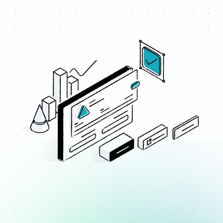
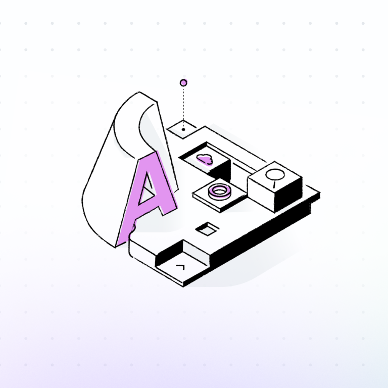
Illustration
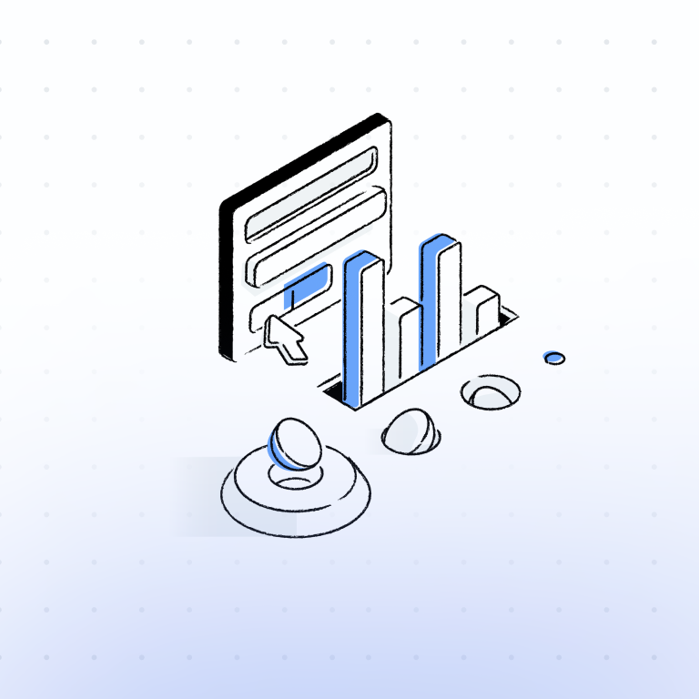
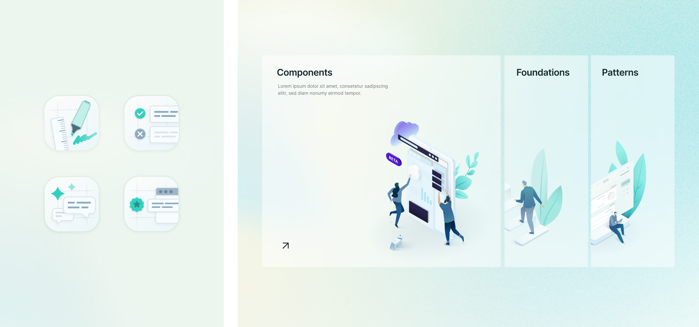
Art directing illustration style with high fidelity samples
Together with the team, I also helped refine the art direction for our illustrations. I developed a series of vector illustrations that helped the team clarify the content as well as the specific qualities we wanted, such as colors, line textures, and dimensions.
Interaction
Prototyping cursor interactions with the real material (i.e. code)
The gradient as an embodiment of “Aura” is at the heart of the site’s visual language. To render the gradient more lively, I explored the idea of incorporating a cursor interaction: the gradient will slowly and subtly follow users’ cursor when they move around on the page.
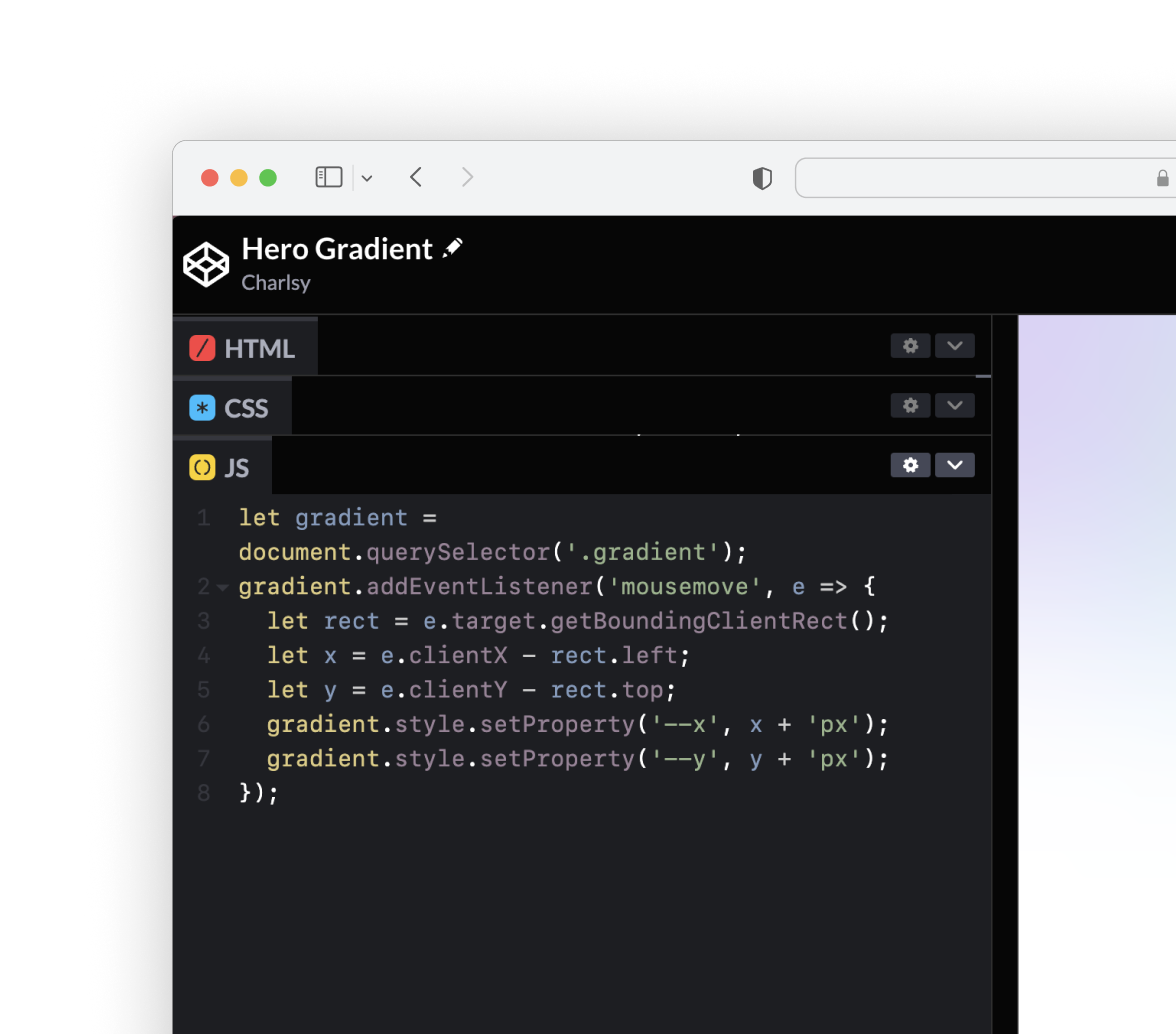
I leveraged CSS and JavaScript to prototype different versions of the interaction so that the team was able to play around with them and understand how each of them felt. In this way, I was not only able to convey the vision in a vivid way, but also help close the gap between design and development and ease the hand-off process later on.
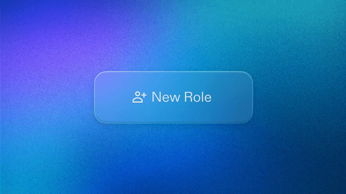
Micro-interaction
Sprinkling moments of delight
I also worked on multiple micro-interactions to make the site feel alive.
Teaser
However, we took a pivot…
The project underwent a significant change in direction after stakeholders review. Below is a glimpse at the new design direction.
Interested in how I navigated the challenge? Hit me up for a deep dive of the project.
Let’s chat.