Rubrik Security Cloud (RSC) is Rubrik’s data security SaaS platform. In RSC, admin users can create roles with different permissions, enabling a Role-Based Access Control (RBAC). The feature was originally developed in a tight schedule several years ago and hasn’t been updated since. Some usability issues were yet to be fixed. As the product design intern, I undertook the task to address these issues and improve the Role Creation flow.
Problem I
Role template cards don’t contain enough information for users to decide which one to use
As soon as users start the role creation flow, they will see a list of role templates. They can either choose a template to start with or create a new role from scratch.
Users reported in previous research sessions that they found the information on role template cards insufficient. There weren’t enough details and they had to go to the next step to understand what are the presets for each template. Sometimes they had to keep going back and forth to decide which template to proceed with or they’d rather create from scratch.
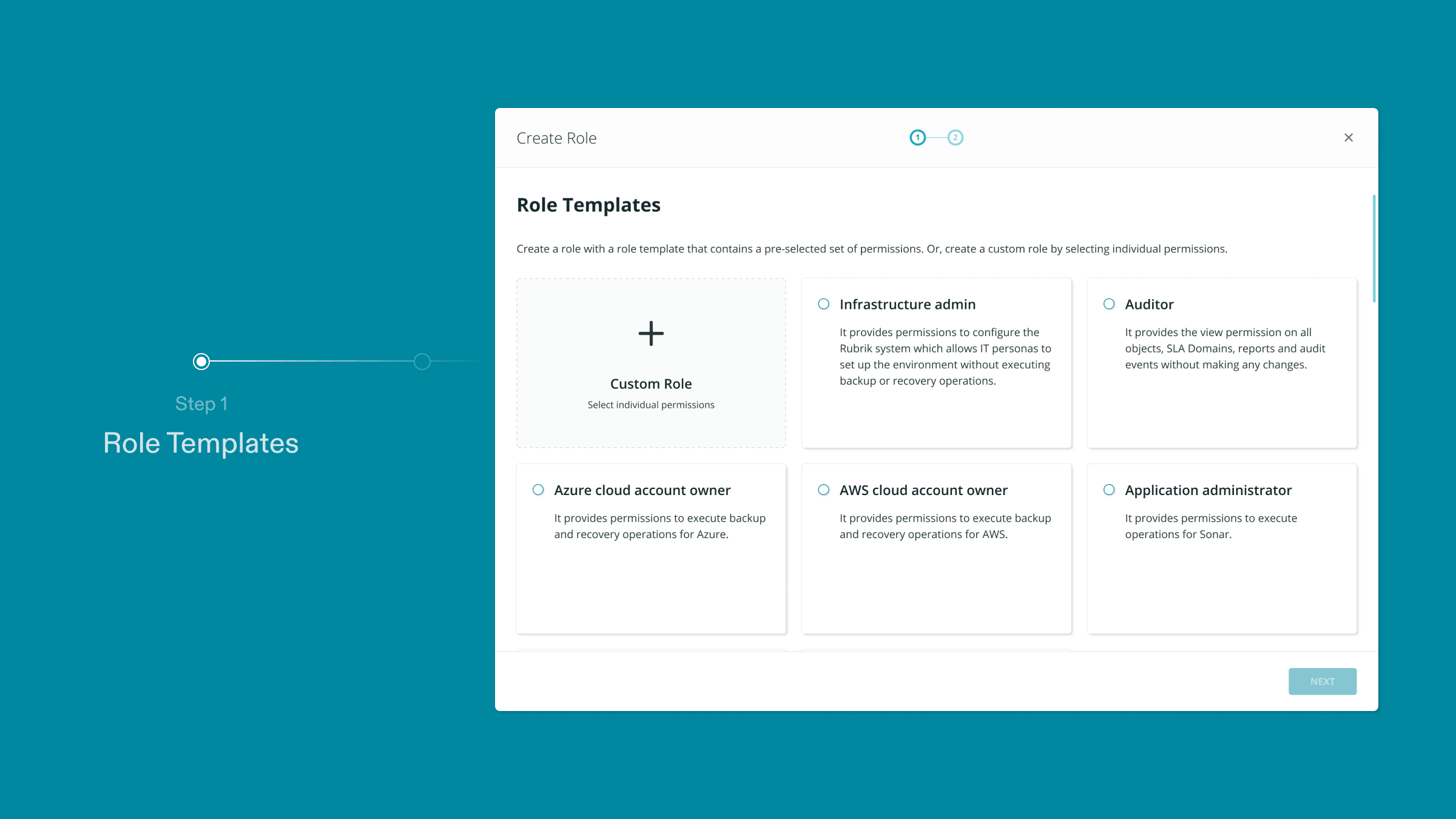
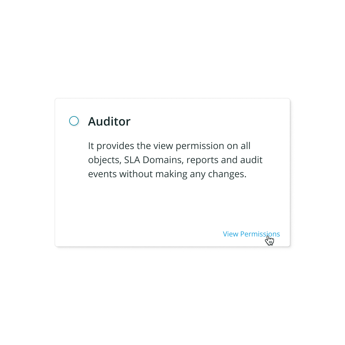
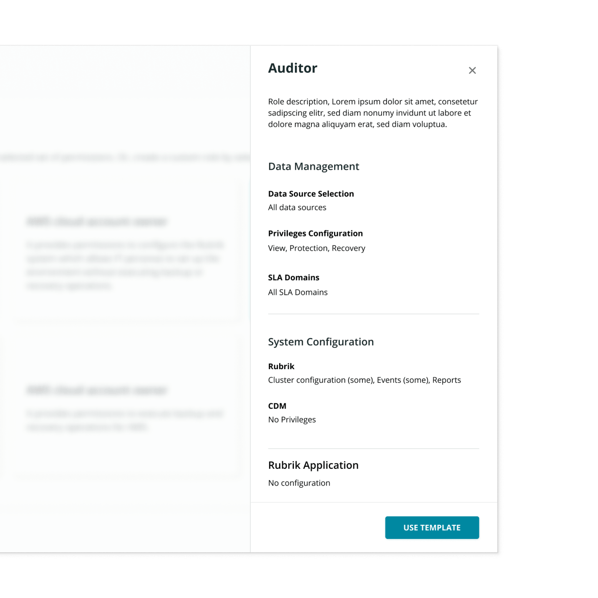
Solution: Role template preview
The solution was straightforward: a preview button that opens a tray showing a high-level summary of the permissions configured for each template. Users can start building with the template right from the tray, eliminating one extra step.
Problem II
Permission cards are cluttered, unscalable, and suffering from usability issues
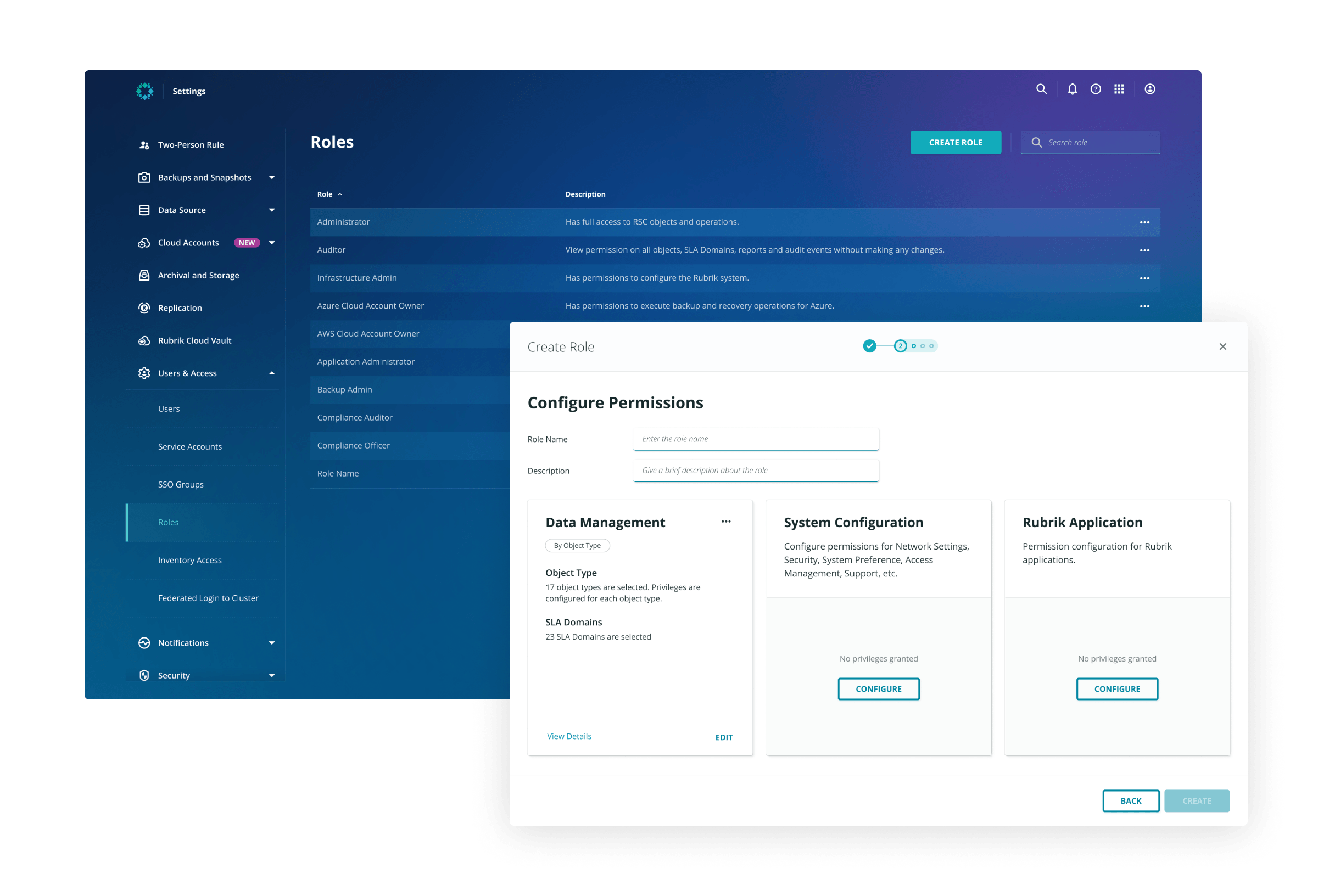
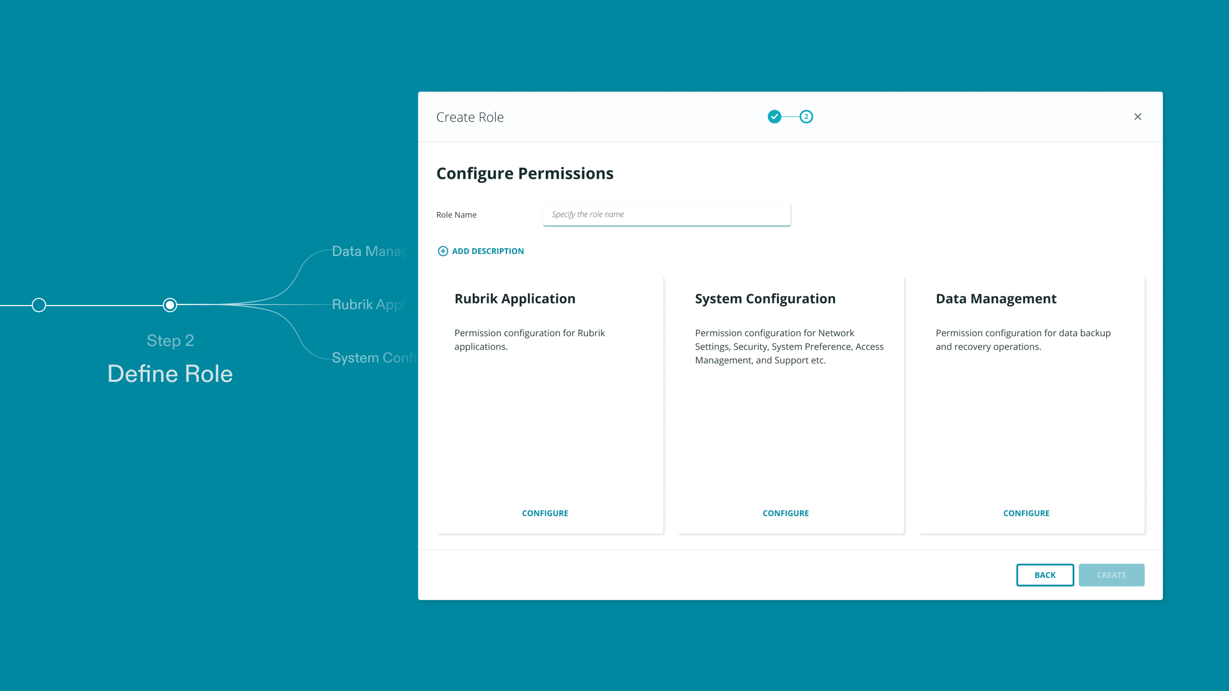
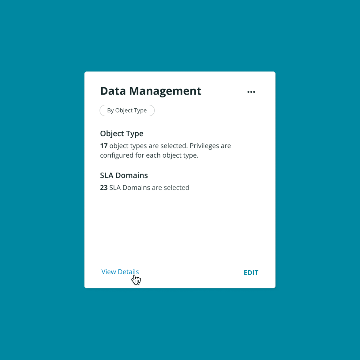
After the template decision, users arrive at the “console room” for role creation, where they name the role, provide descriptions, and start configuring permissions. From here, users go on separate paths to configure three types of permissions and at the end of each path they return to the console room to review their configuration.
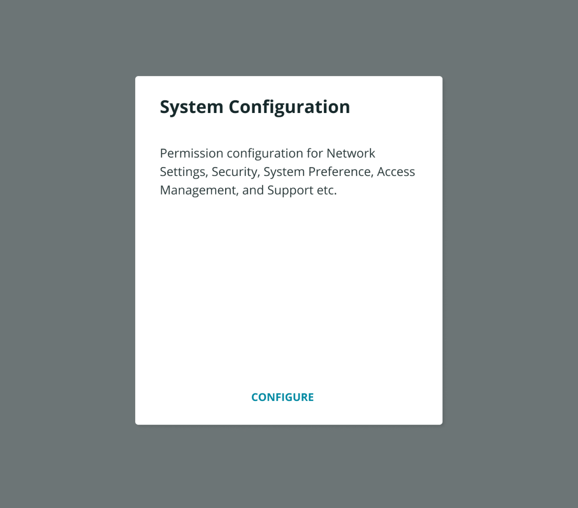
Therefore, there are two states of these “permission cards”: filled and empty. The problem is that the empty state doesn’t provide enough visual affordance that invites users to set out selecting permissions, while the filled state is cluttered, unscalable, and suffering from usability issues.
Solution 1: Better visual cue for empty state
Originally, the empty state didn’t make clear to users that there are three buckets of permissions awaiting to be filled. To provide better visual cues, I altered the appearance, leveraged copy text, and made call to action more pronounced to convey a sense of “undone”.
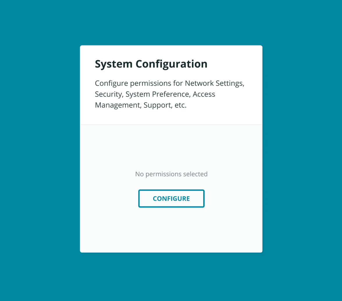
Solution 2: Progressive disclosure for granular information
While the original card design exposed detailed information up front, it’s not scalable when the quantity of information soars. To accommodate a large number of permission selection, I decided to only show a brief summary on the card while adding a “view detail” button for access to more granular information.
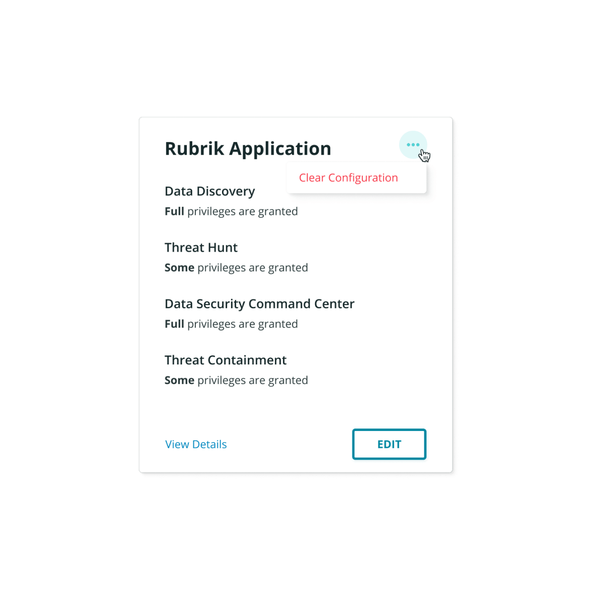
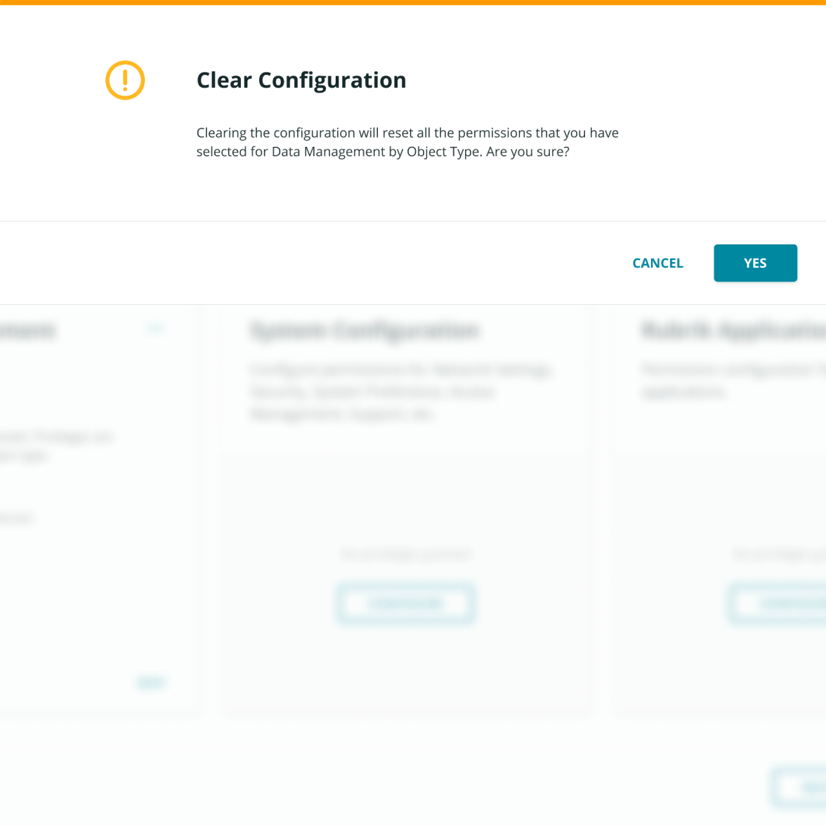
Solution 3: Hide “Clear” button by default and add confirm modal
There was a severe usability issue for permission cards: when users click the “Clear” button, previous configuration will be cleared without any form of confirmation. Other than the obvious solution to add a confirm modal, I also hid the “Clear” button in the three-dots overflow menu as it’s an infrequent action—an assumption later validated by research.
Problem III
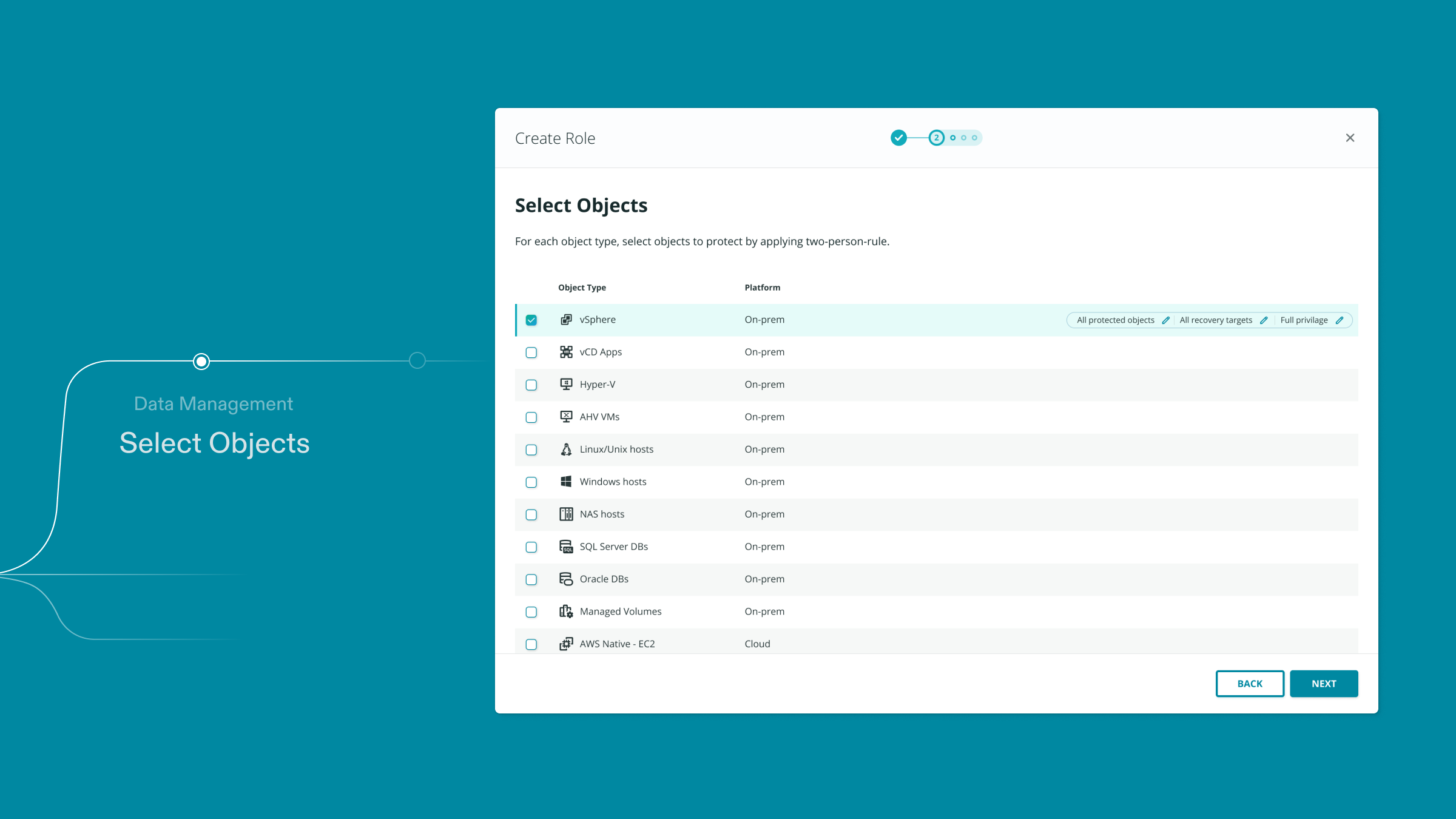
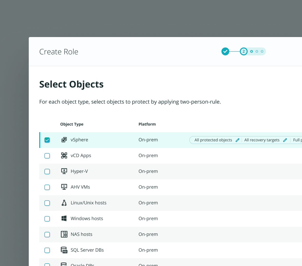
Previous research revealed that users consistently ignored the chip rows in the table
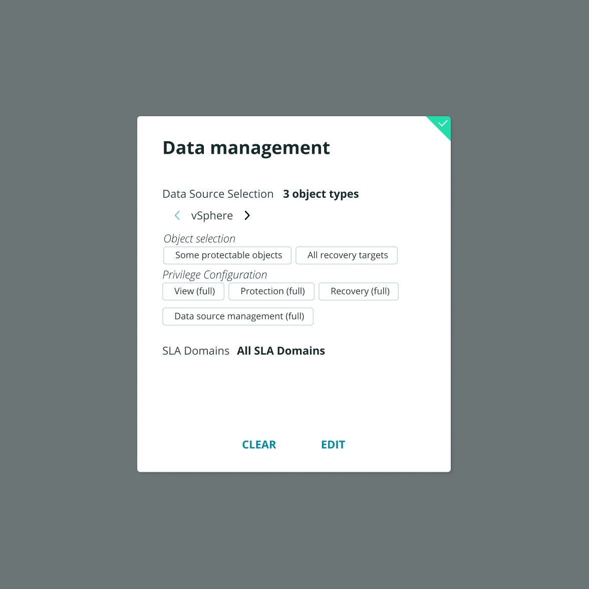
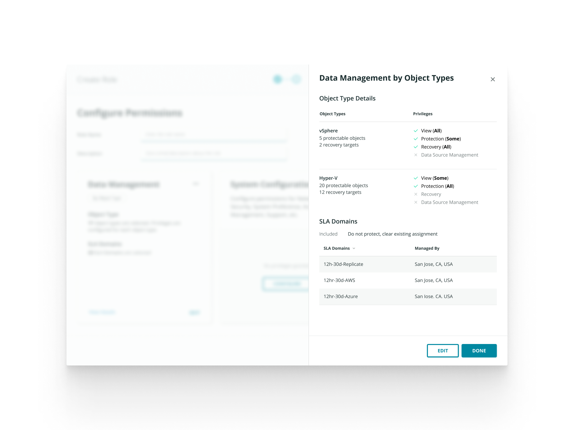
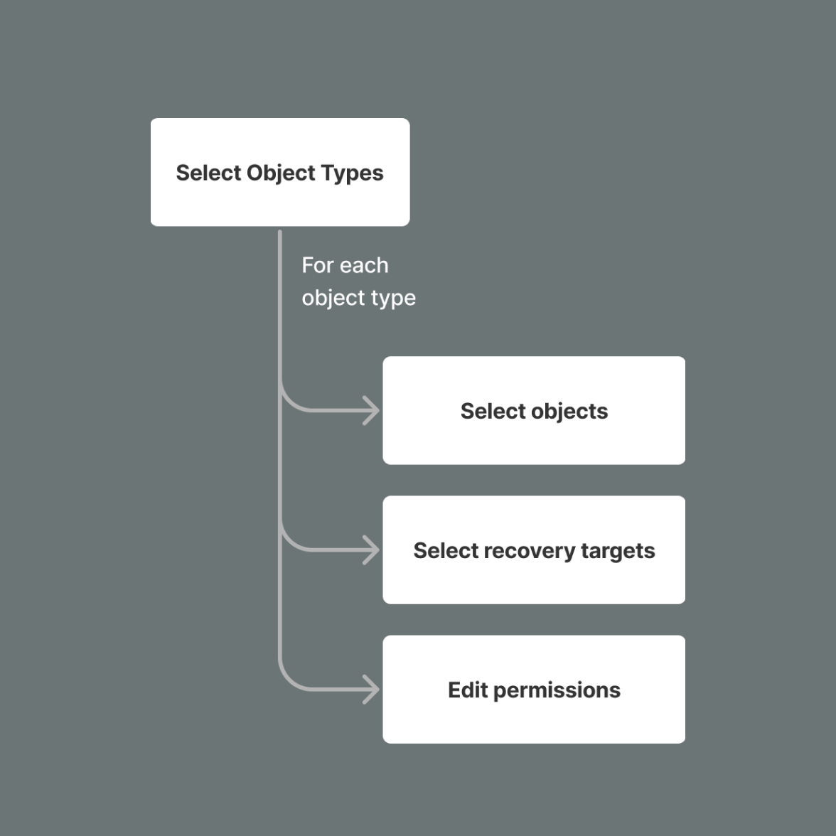
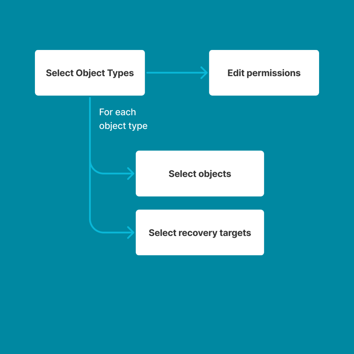
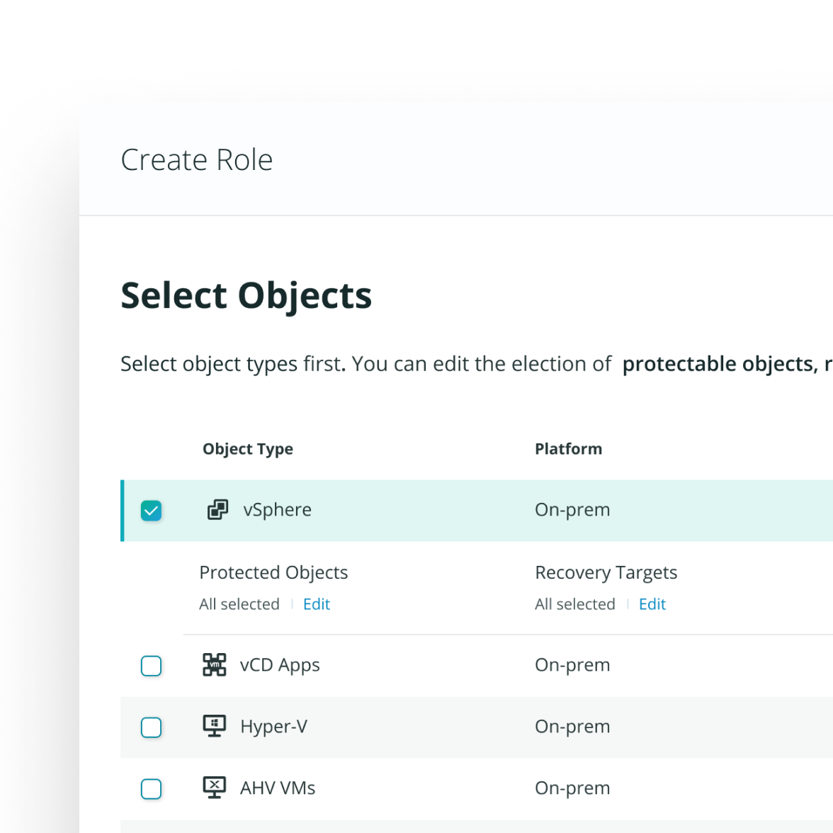
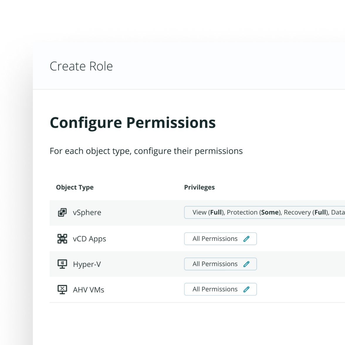
Out of three types of permissions, “Data Management” is the most complex. Generally, users need to first select the data sources (what does the role have access to) and then the permissions to these data sources (what does the role can do with them—view, edit, etc.).
When users select data sources by object type, they need to configure permissions on each object type. However, a problem uncovered in research is that the chip row on each object type is not “discoverable”. Users’ intuition was to go to the next step after they’ve selected the object types.
Solution 1: Leverage expanded row to increase discoverability
To solve the discoverability issue, I leveraged the table pattern’s expanded row component in our design system. In this way, I made it clear that there are more granular selections user can configure for each object type. The visual change in layout is also more drastic that should get user’s attention.
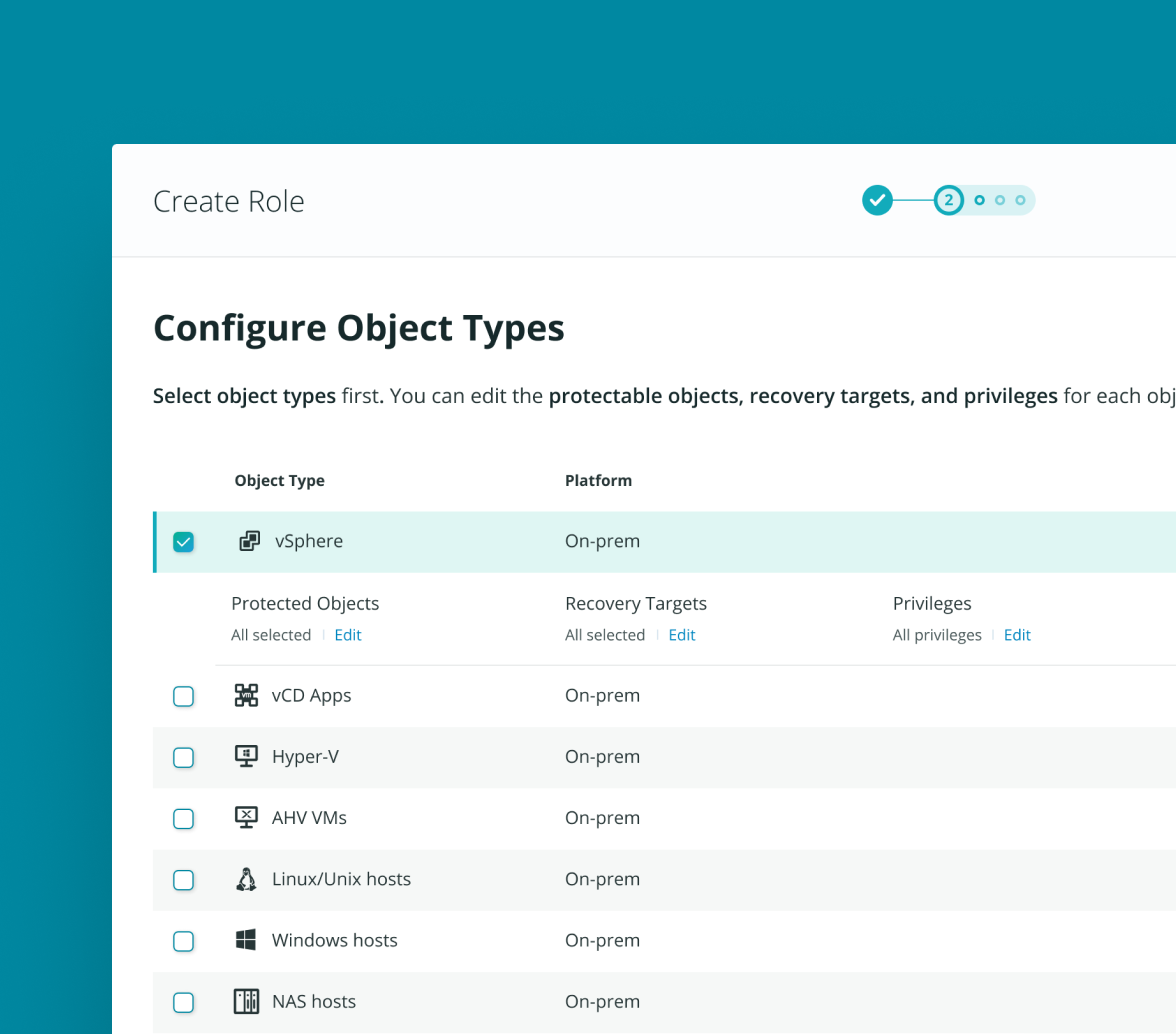
Solution 2: Breaking the flow into 2 steps—one thing at a time
Another cause of the issue, I figured, was intermingling the selection of data sources and the editing of permissions into one step. It was therefore unclear what users need to do, when the modal title says “selecting objects” but editing permissions is also included. As a result, I decided to break the flow into two steps with one thing at a time.
Evaluation
However, testing with users proved my assumption wrong…
My designer brain that loves logical coherence realized that it might not always be a good thing.
Interested in the process and what I learned from the evaluation? Hit me up for a deep dive of the project.
Let’s chat.