Alliance for Pioneer Square, the non-profit behind Seattle’s first neighborhood, is in need of a distinct and unified visual system. In an effort to streamline the brand’s identity, I redesigned its logo, created a new visual language, and gave a make over to its home on the web. I documented part of the design process in depth, which you can read on my blog.
Background
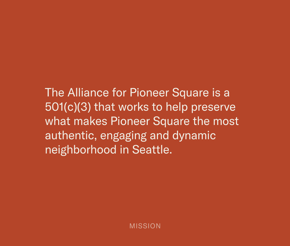
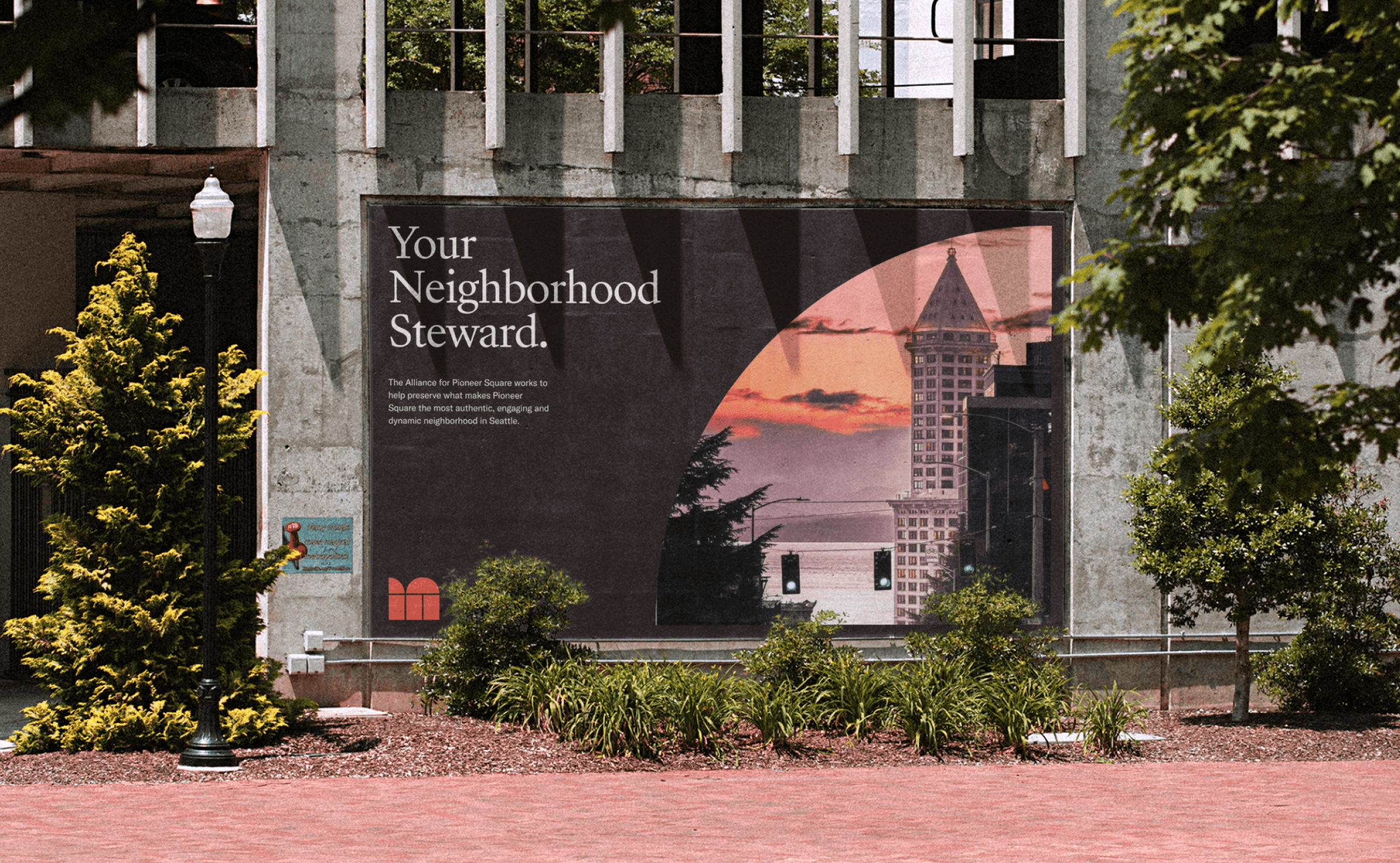
Alliance for Pioneer Square is the non-profit organization behind Seattle’s first neighborhood
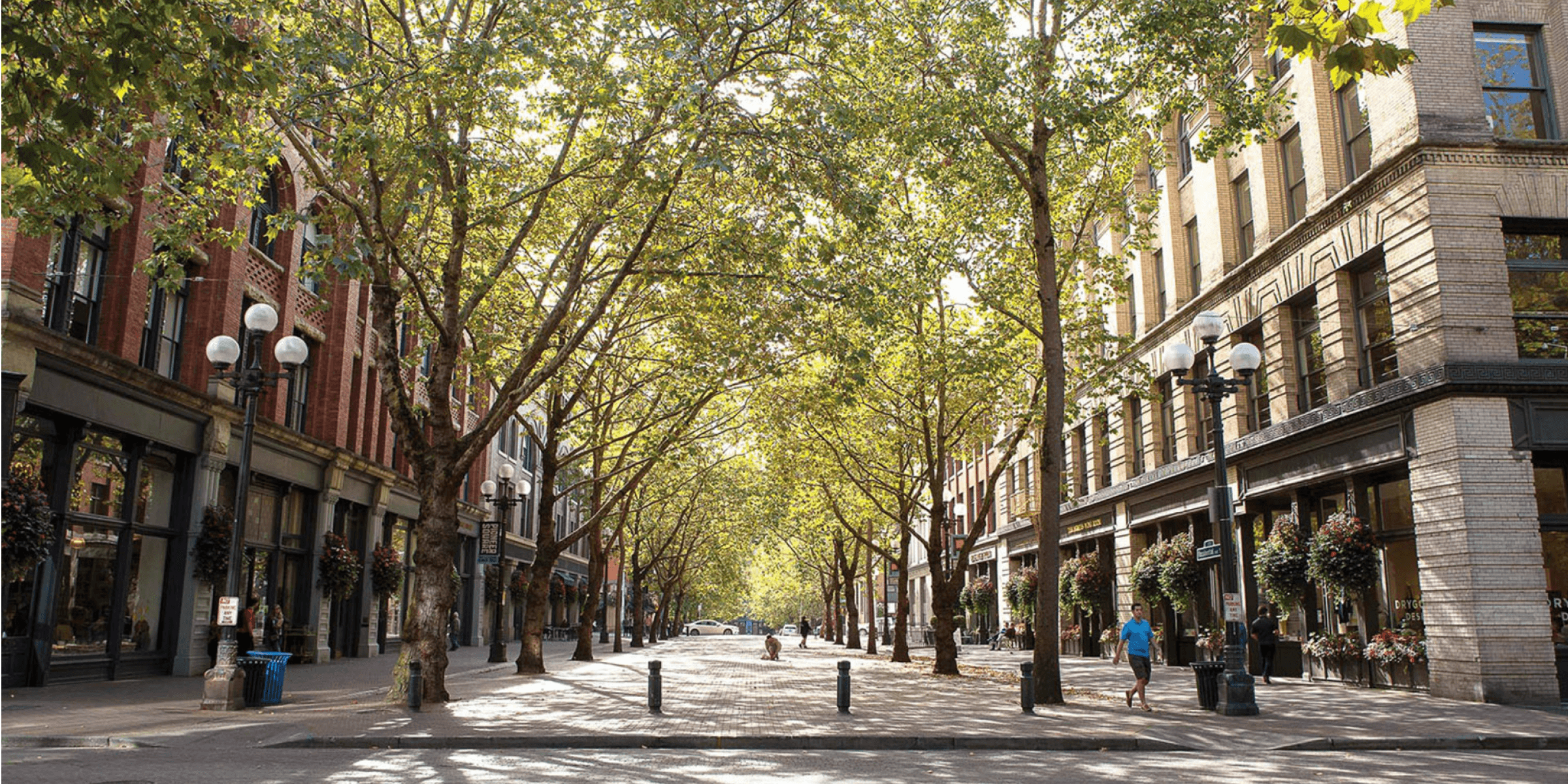
Pioneer Square is the birthplace of Seattle, the city’s first neighborhood. Rebuilt after the “Great Fire” of 1889, the district is characterized by late nineteenth century brick and stone buildings. Behind the neighborhood is the Alliance for Pioneer Square, a non-profit organization that works on its preservation and development.
As a standalone organization that serves diverse stakeholders, the Alliance for Pioneer Square lacks a consistent and recognizable visual language across communication channels, while its website presents a slew of navigation challenges to visitors. The Alliance’s brand identity is in need of a modern revival that coincides an overhaul of its web presence.
Result
A brand new identity with a refreshed web experience
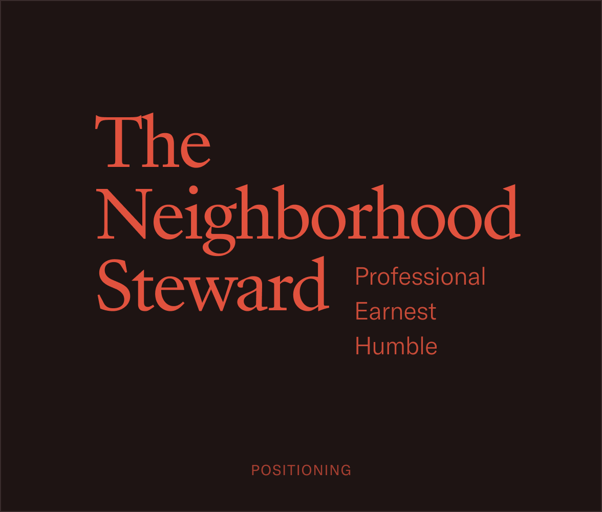
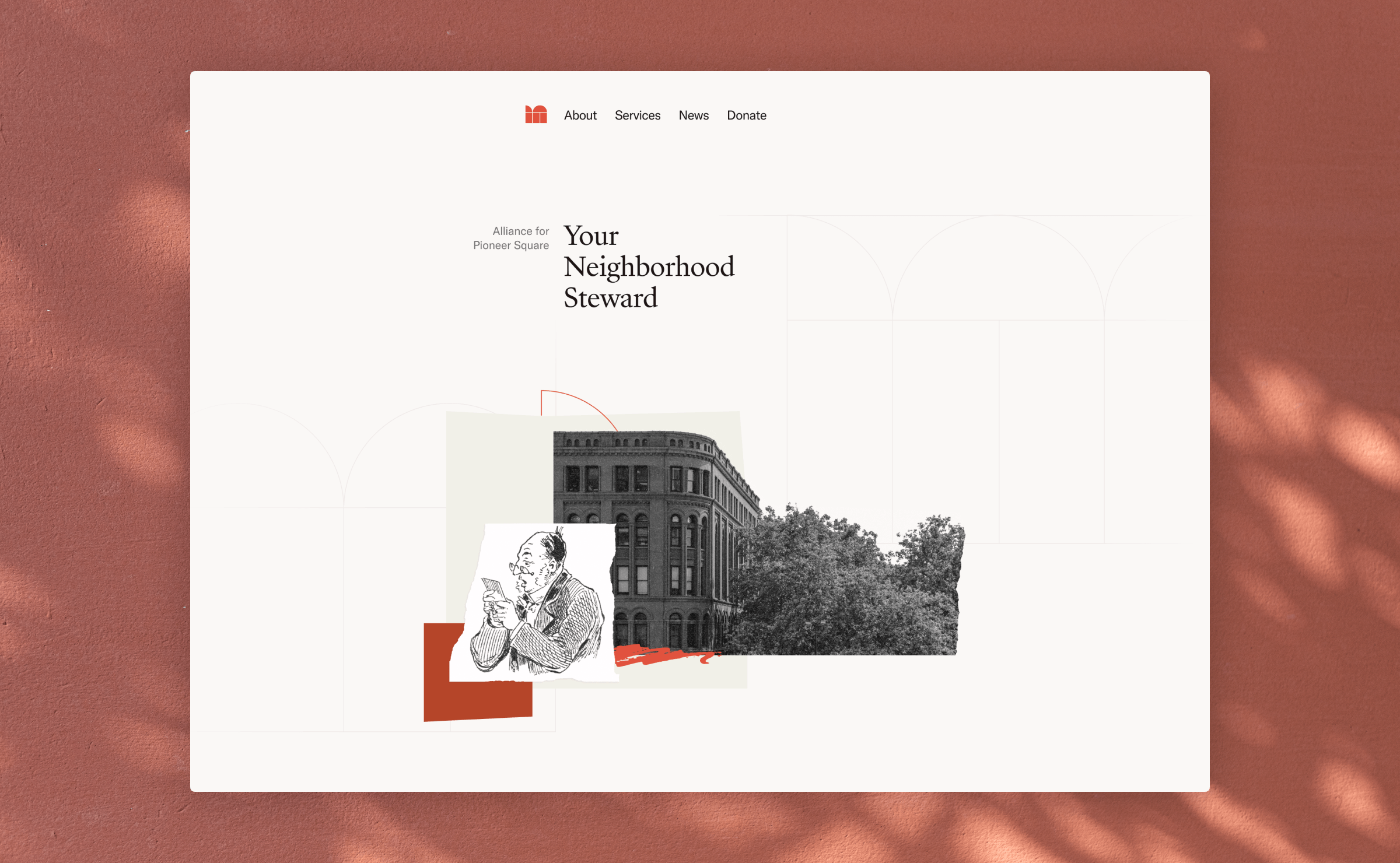
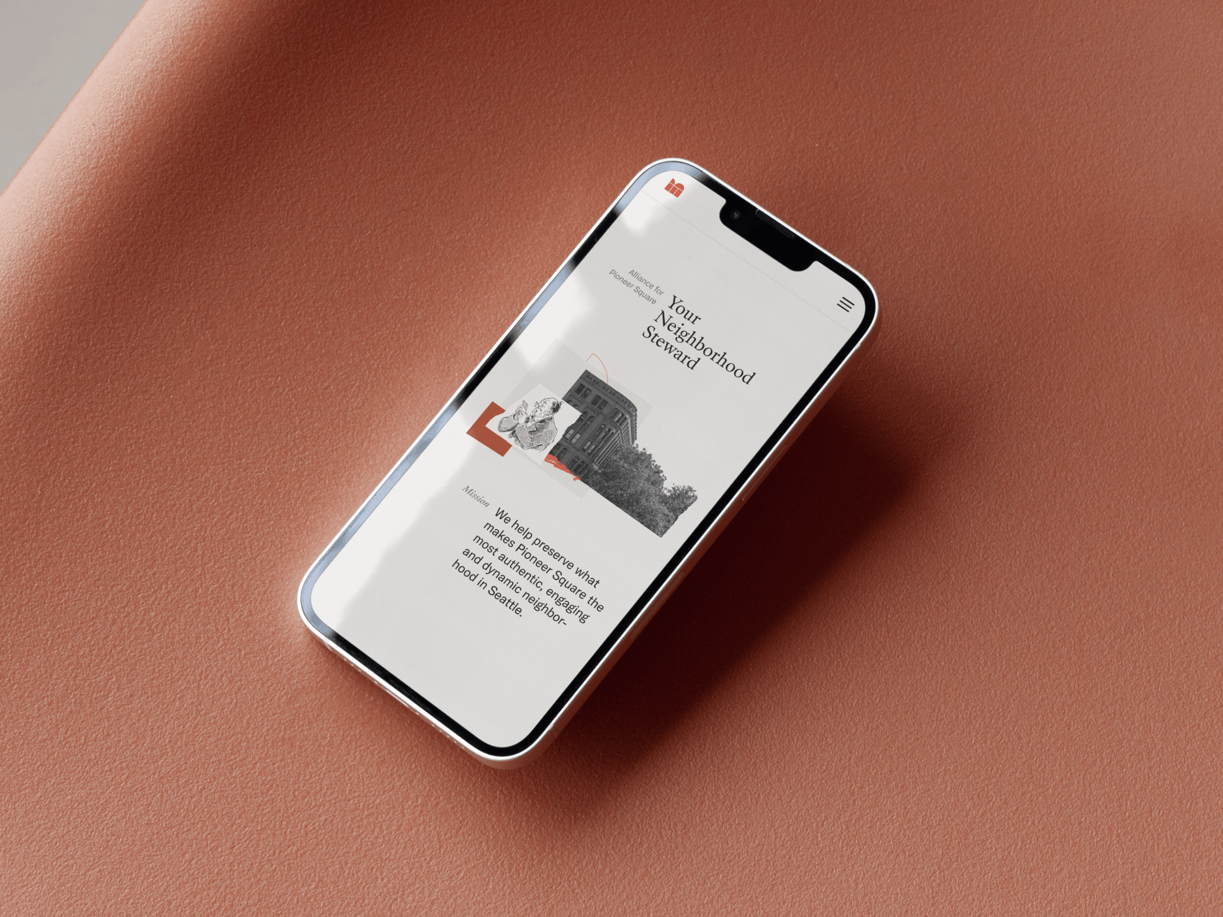
The new identity is built on a message that sits at the core of the organization—to serve as the neighborhood steward. I identified three brand attributes that exemplifies the qualities of a steward: professional, earnest, and humble. A steward takes care of the neighborhood seriously with their expertise and utmost sincerity, whilst keeps their head down and never calls attention to their achievements.
The refreshed visual system seeks to cultivate a sense of trust, communicating the organization’s role as a credible and professional steward.
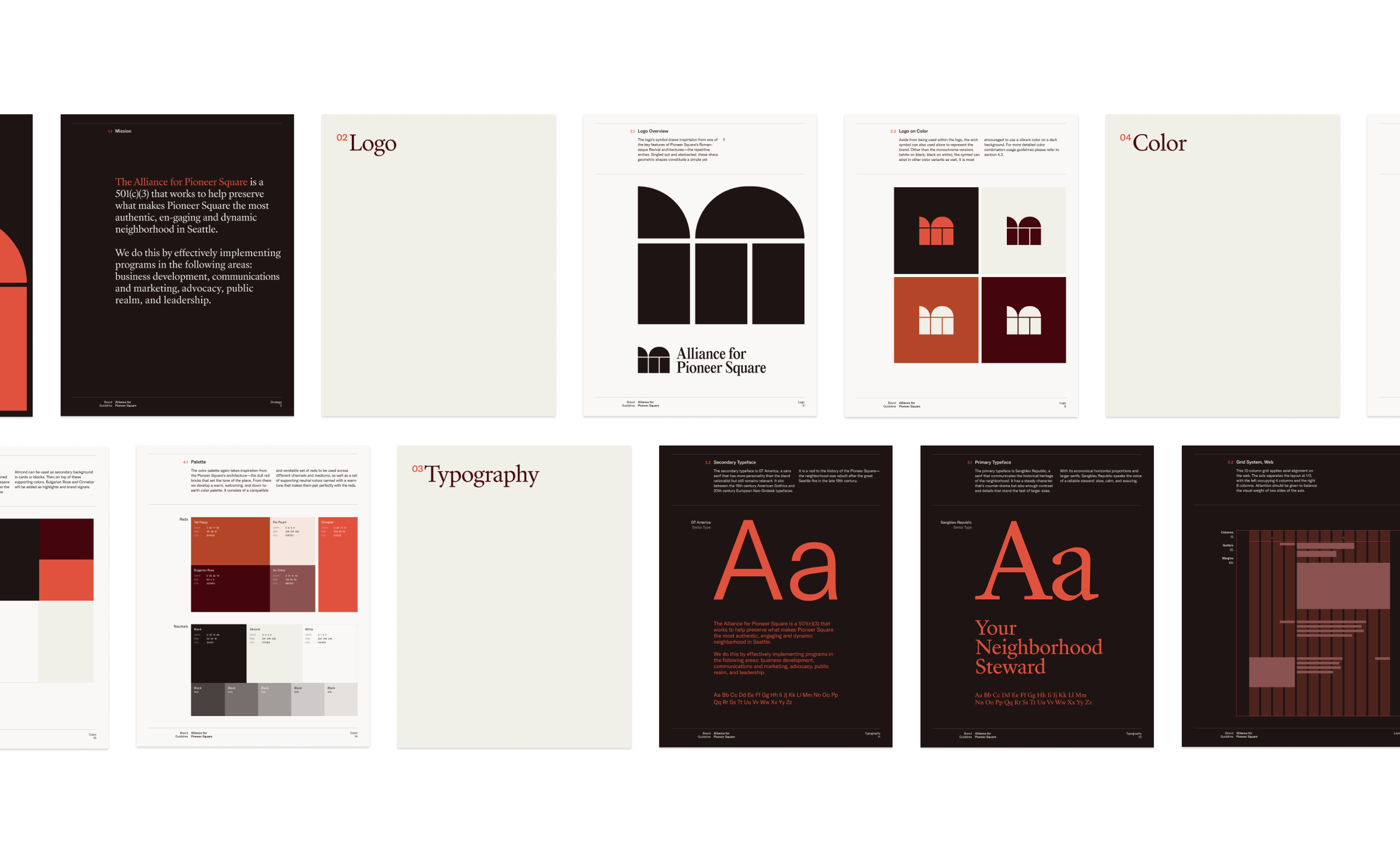
Logo
A new identity inspired by the Romanesque Revival architectures, signature of the Pioneer Square
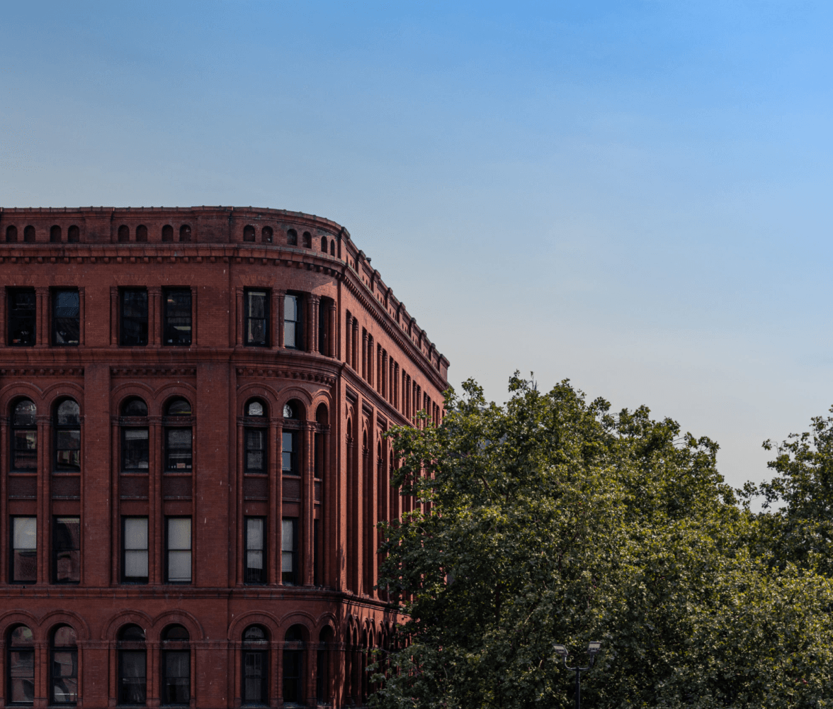
The logomark draws inspiration from one of the key features of Pioneer Square’s Romanesque Revival architectures—the repetitive arches.
Singled out and abstracted, these geometric shapes constitute a simple yet powerful icon that is representative of the architecture and a connection to the history. Instead of a single arch, another half is added to convey the continuity of patterns as well as the neighborhood’s cultural assets.
Read more on how I came up with the concept
The logotype is set in Editorial New, a modern serif typeface that’s lean and clean—inspired by the form factor of Pioneer Square’s street types.
Visual Language
A fusion of history and modernity that’s warm and welcoming
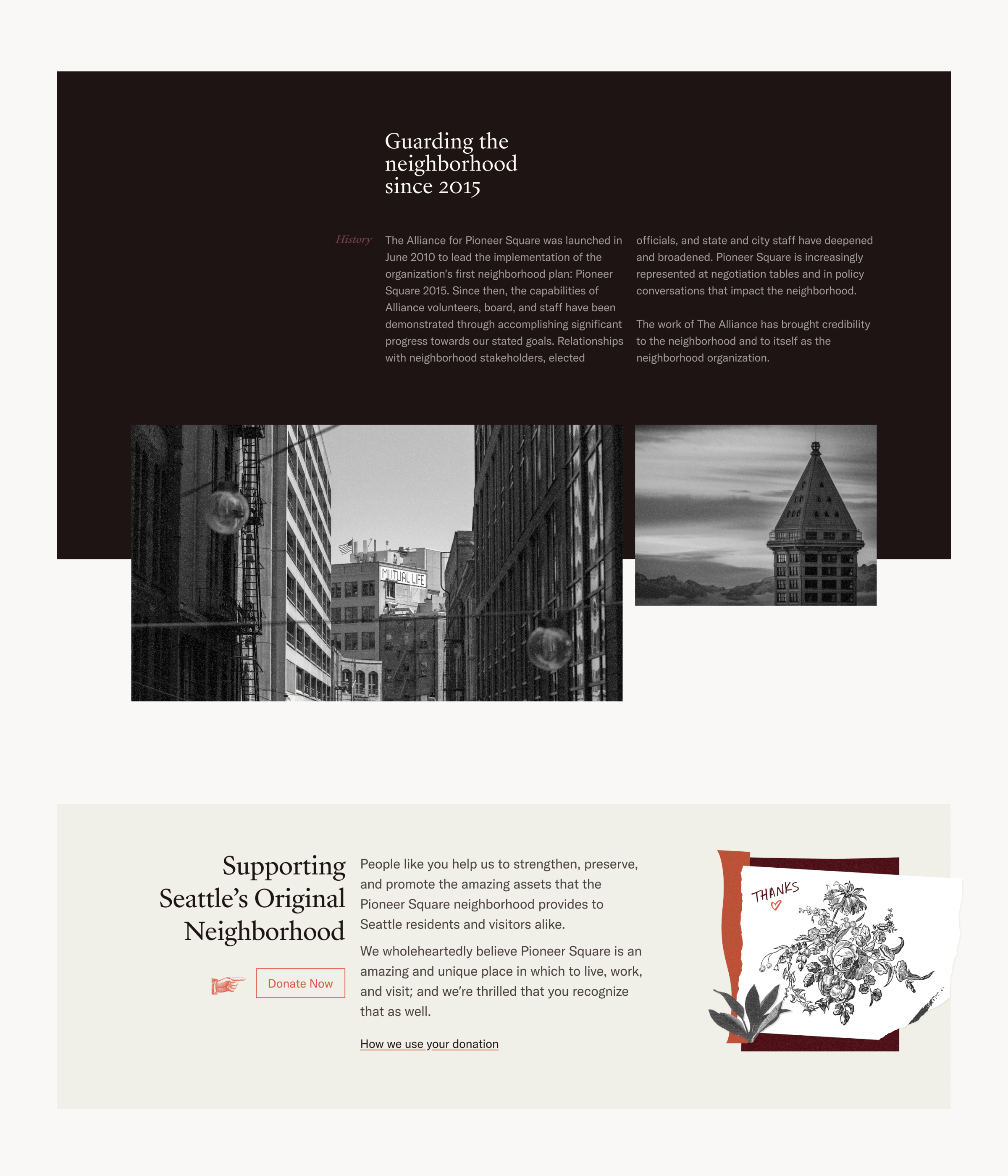
The new visual language is one that balances seriousness and liveliness. It has a classic side that honors the rich history of the neighborhood as well as an energetic side that makes it feel novel and relevant.
Typography
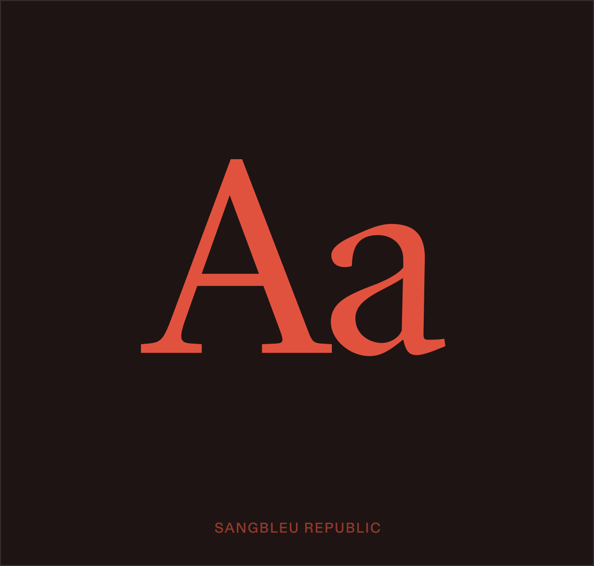
A serif like Sangbleu Republic communicates the historical heritage of the neighborhood. It not only has a steady character that’s counter-drama but also enough contrast and details that stand the test of larger sizes. With its economical horizontal proportions and larger serifs, Sangbleu Republic speaks the voice of a reliable steward: slow, calm, and assuring.
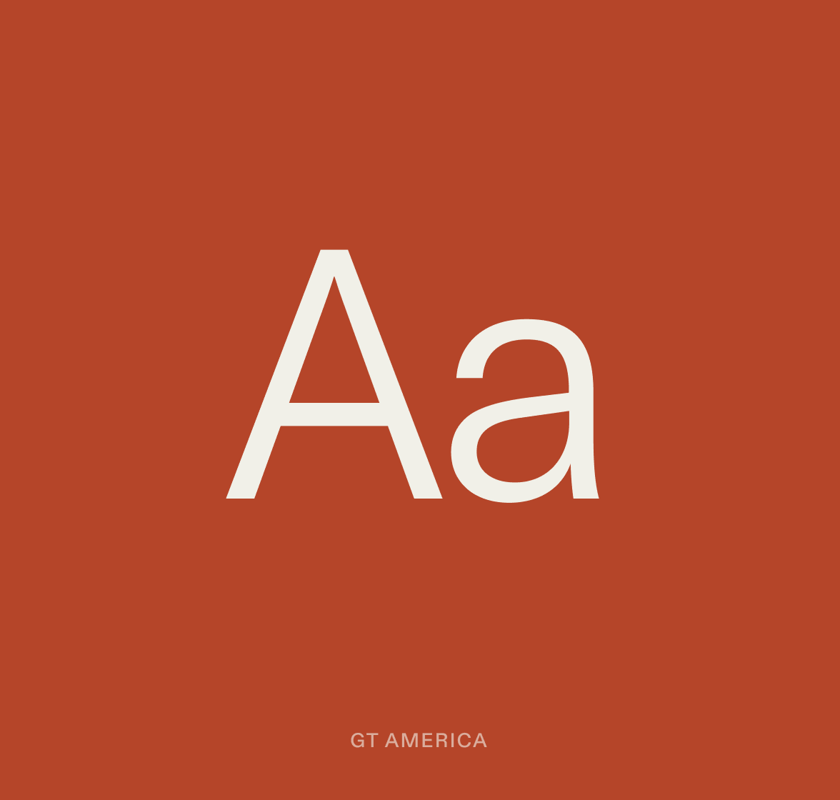
GT America, a grotesque sans serif that sits between the 19th century American Gothics and 20th century European Neo-Grotesque, pays a subtle nod to the history of the Pioneer Square—a neighborhood reborn in the great fire of 1889.
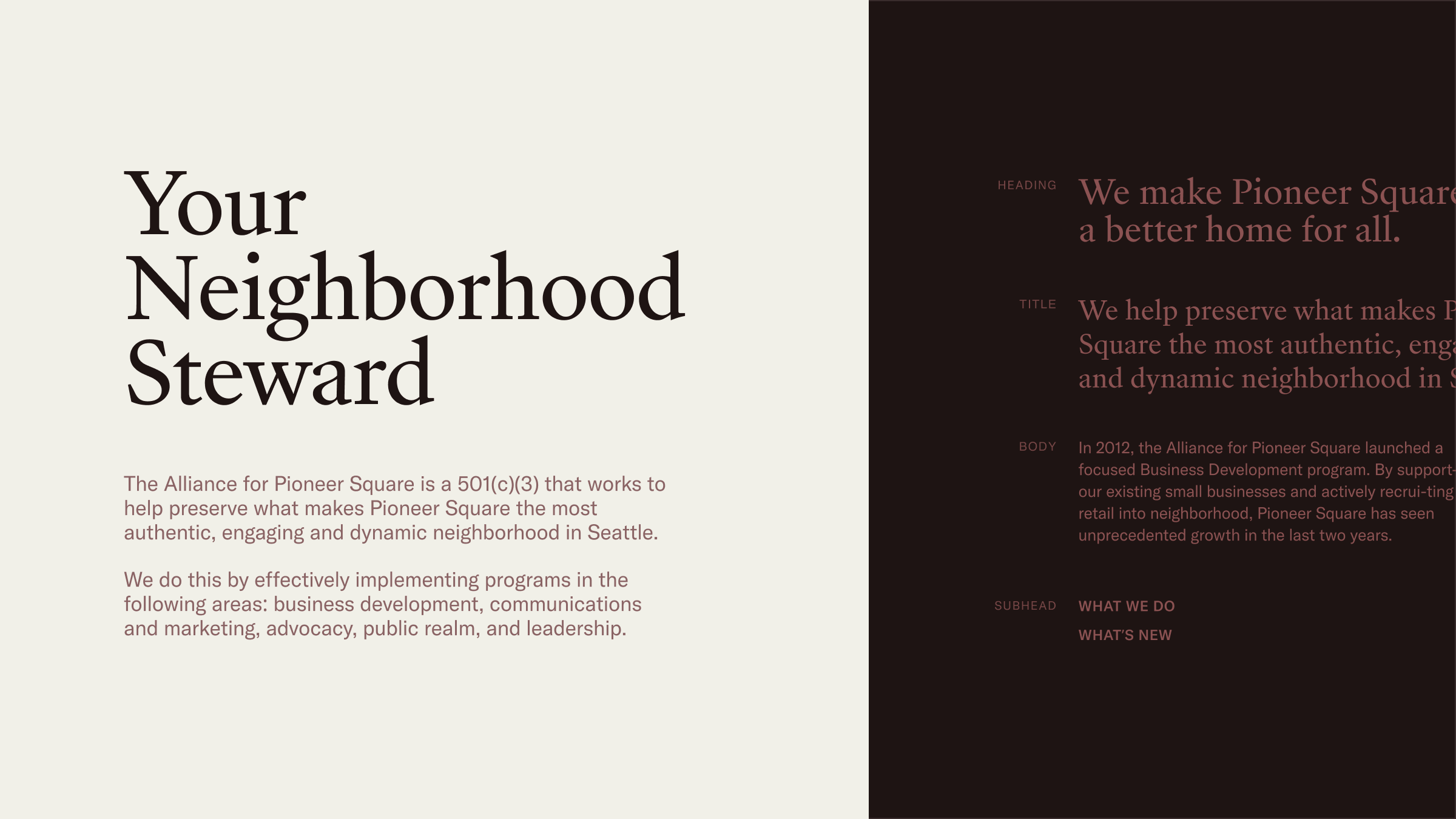
The unassuming quality of a steward calls for a restraint use of type styles. The range of type sizes is intentionally kept minimal—just enough to establish effective information hierarchy. Even the largest heading takes a moderate size, just as a down-to-earth steward is unlikely to shout. Instead, he delivers the truth with grace and composure.
Color
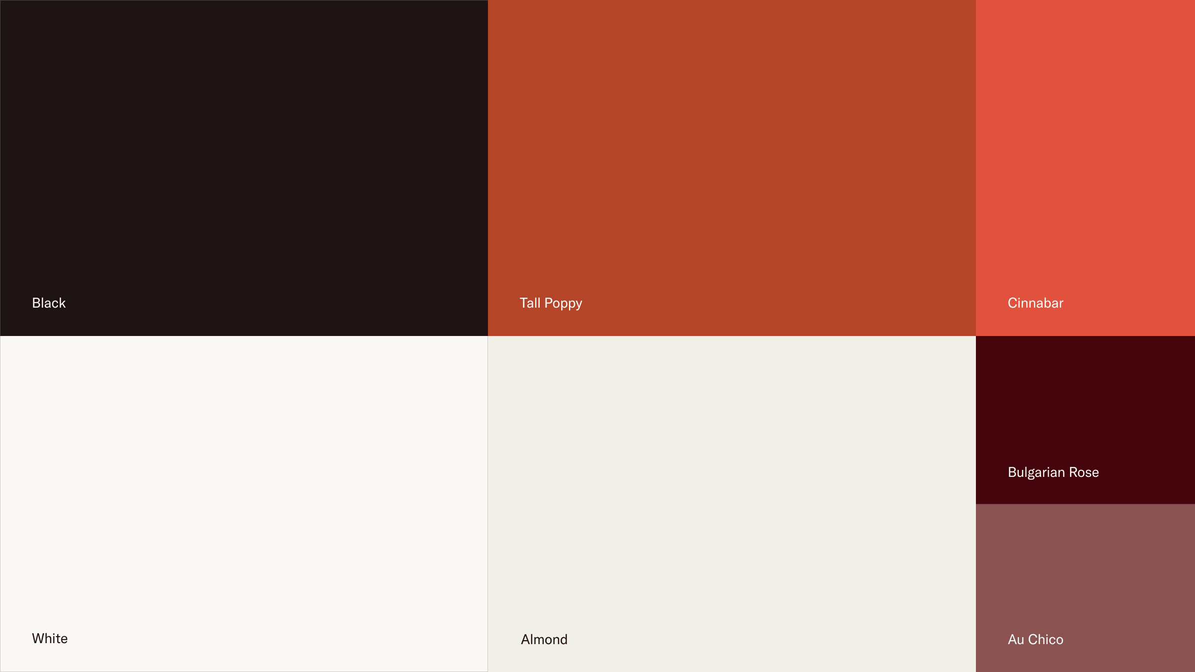
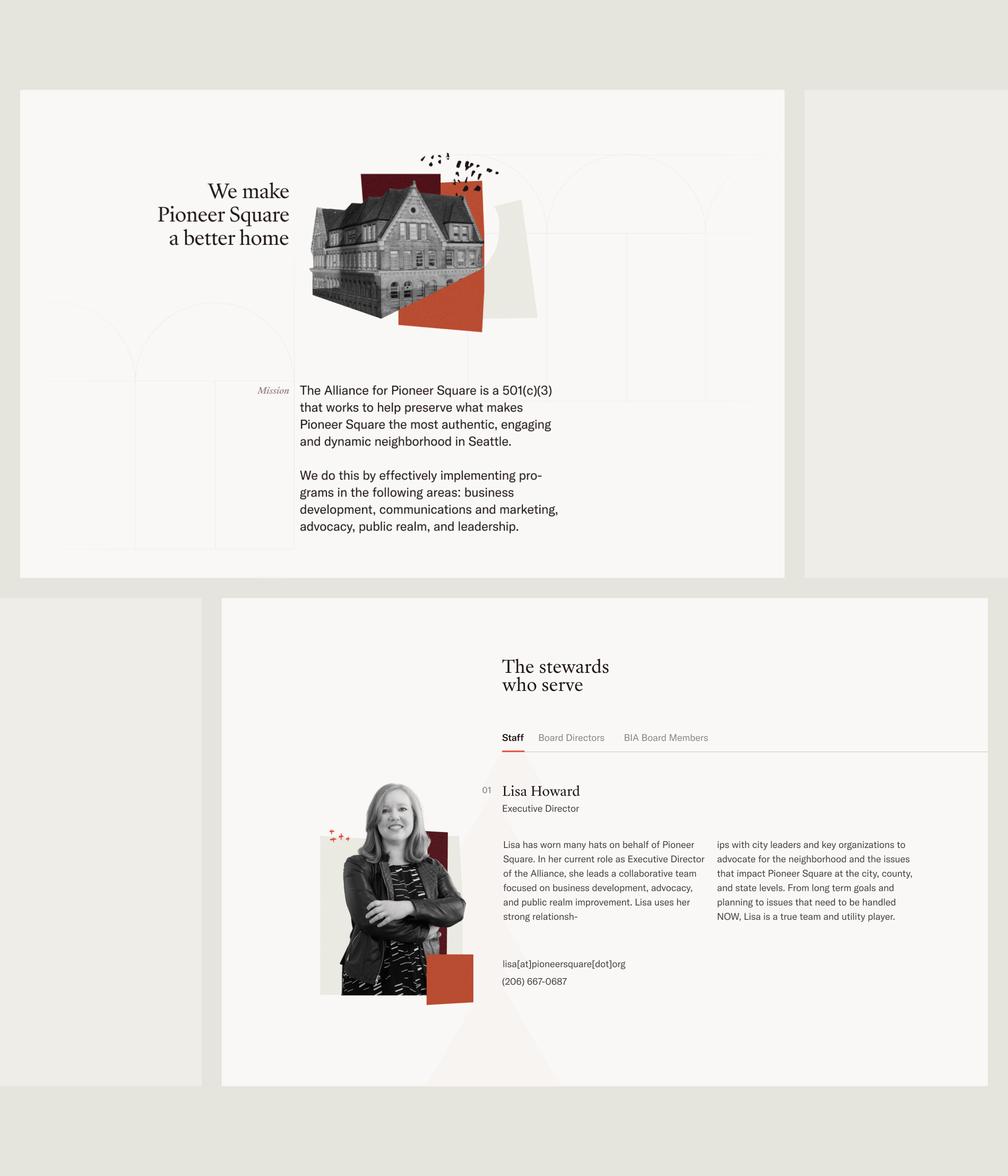
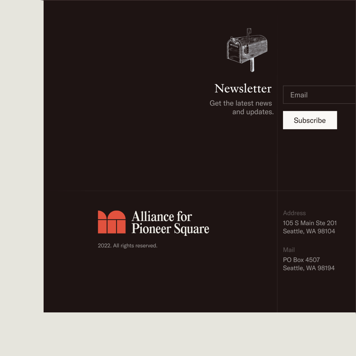
The color palette again takes inspiration from the Pioneer Square’s architecture—the dull red bricks that set the tone of the place. From there I developed a warm, welcoming, and down-to-earth color palette.
Imagery
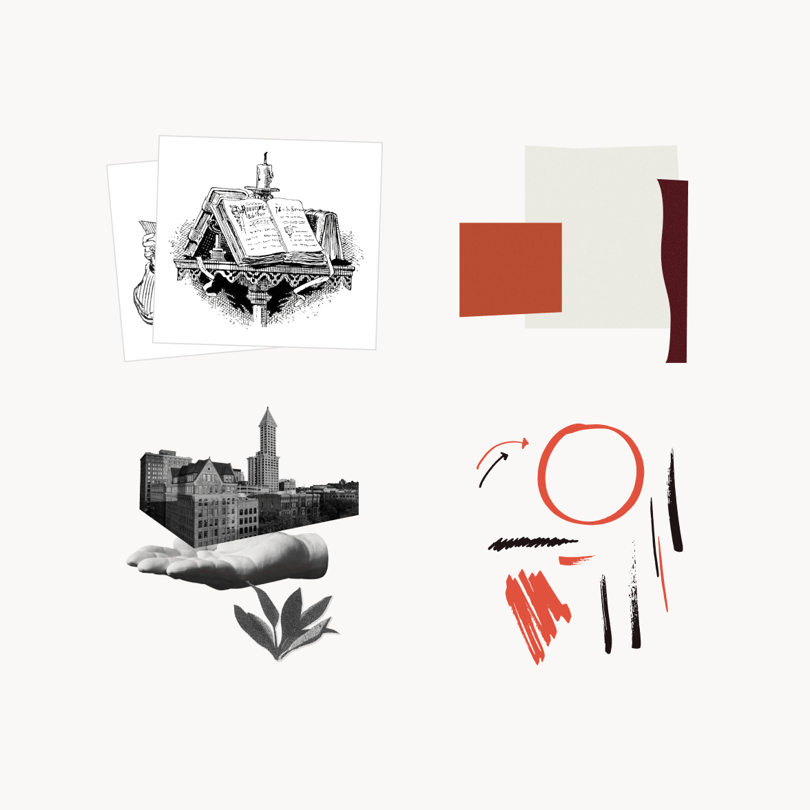
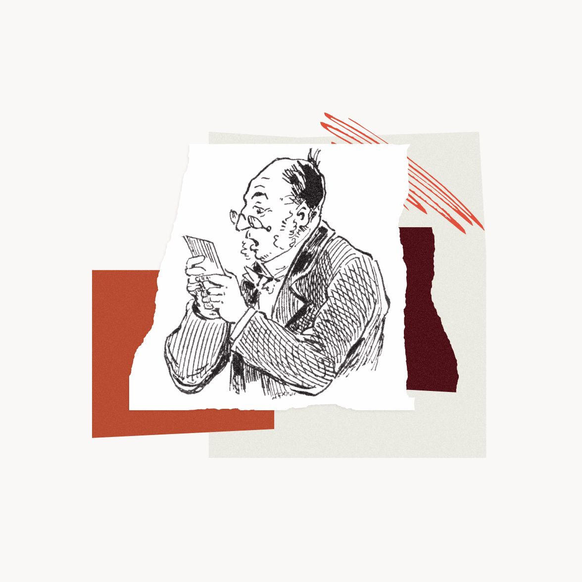
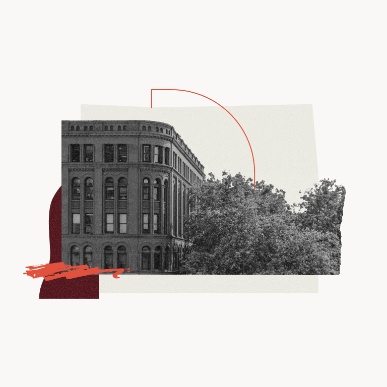
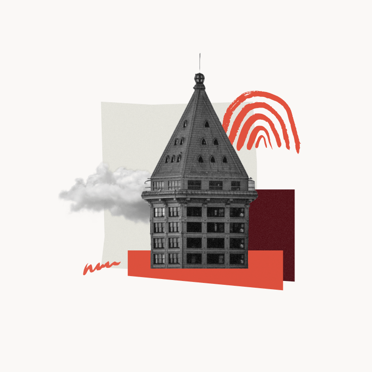
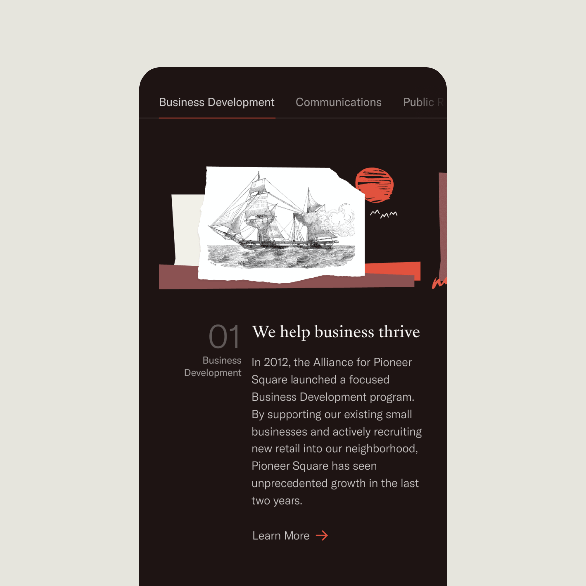
The collage-style illustration is a unique visual trait of Alliance for Pioneer Square’s identity. By combining a diverse set of elements, it creates a collage style that embodies the fusion of history and modernity.
On the modernity side, there are geometric lines and vibrant brush highlights; on the history side, there are cut-out old-book illustrations and monochrome photography. The “planned chaos” of collage adds a sense of liveliness to the otherwise too serious visual system.

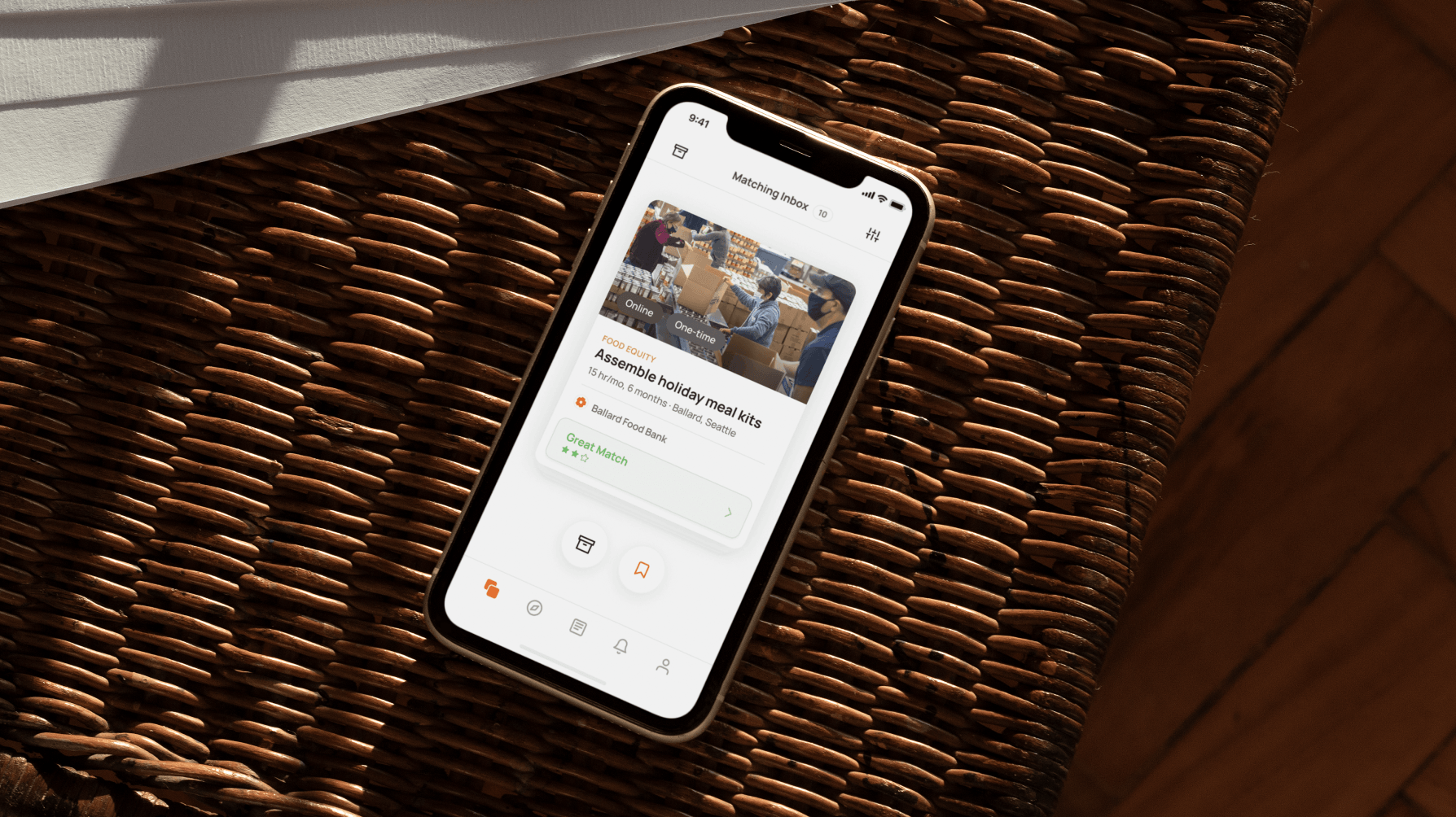
Interactive
A refreshed web experience that balances uniqueness and utility
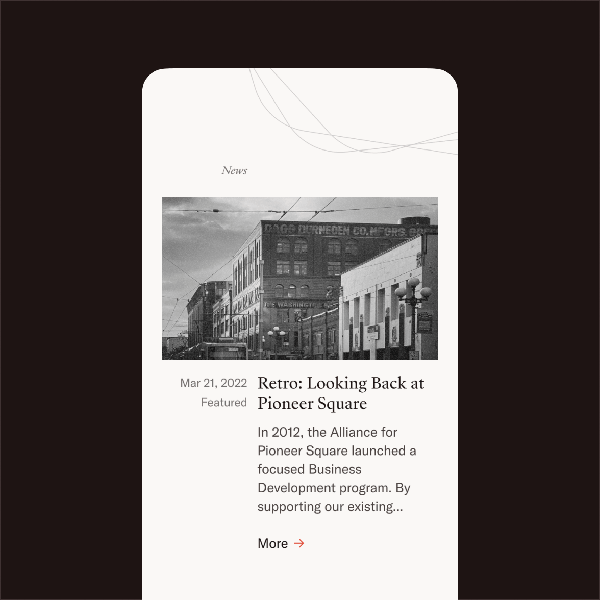
Echoing the construction of the logo, Alliance for Pioneer Square’s visual system features a distinct axial typographic system across channels—including its new web presence—where all elements are organized either to the left or right of a single axis.
Read more on how I developed the layout


Interested in the process and how I arrive at the result? Hit me up for a deep dive of the project.
Let’s chat.